...
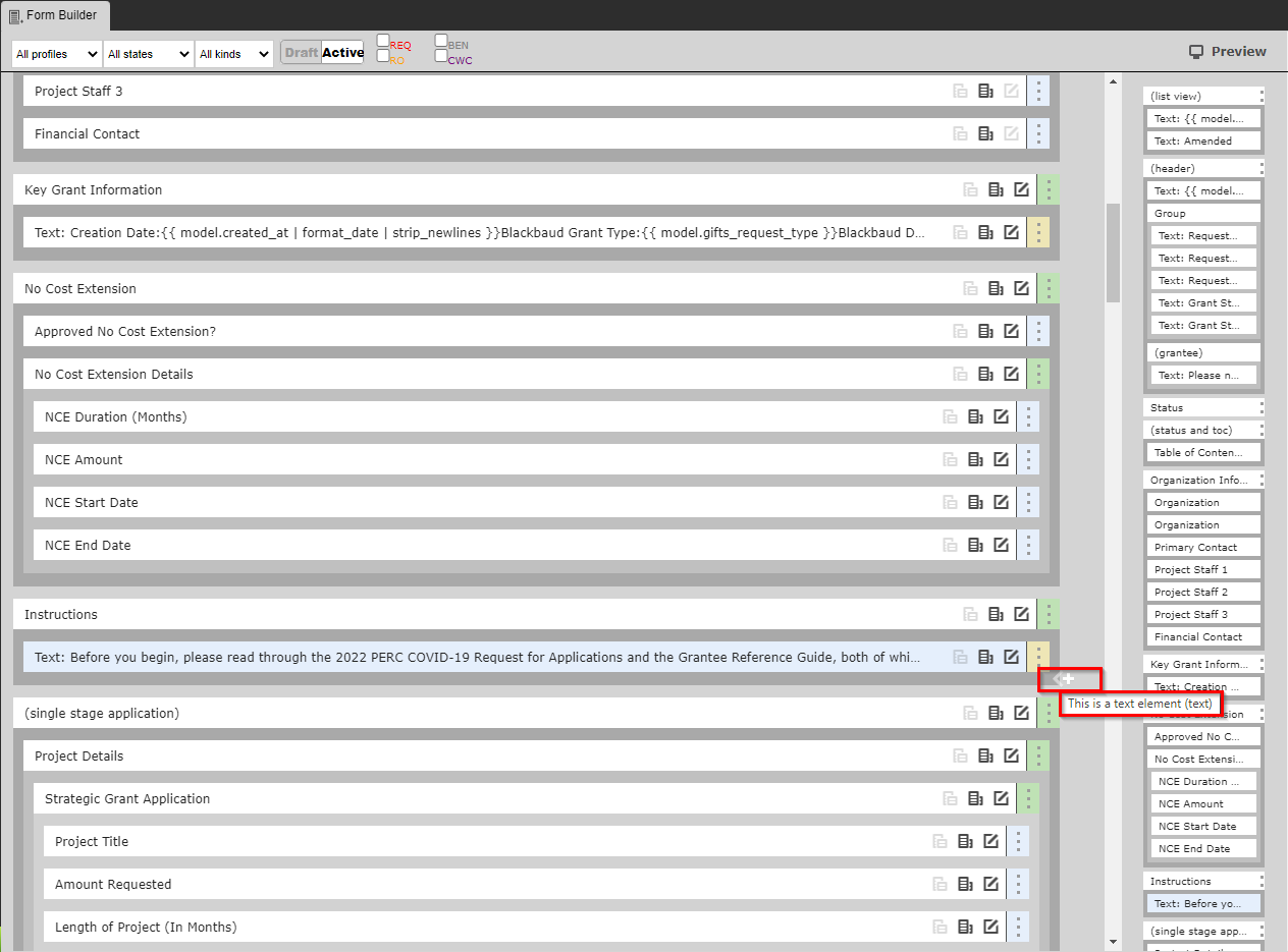
- Box # 1: Shows the Theme (Form) itself (in this screenshot, the 2022 COVID-19 Response Grant Application Theme) in Builder mode. In Builder mode, all of the text and fields that are found on the Theme can be be seen as a rectangular box boxes (see screenshot below for example). Within Fluxx, each separate box is now as an element. The item that is currently selected is highlighted in Light Blue. In the screenshot, above, the Group item "(list view)" is selected. Items selected can be dragged around the screen in Box # 1 in order to move the position of this item around. Example box:

- The Color found on the far right-hand side of each of these boxes indicates what type of item it is on the form.
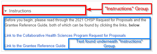
- A Green strip indicates a Group item. Groups are used to organize fields on the form. Text items, component items, and field items can be placed underneath Groups to either visually "group" those items underneath the Group header, or just to group them on the backend for administrative ease without having a visual effect on the Form. See an example of how items get visually "grouped" here below:
- A Yellow (or Gold) strip indicates that the item is Text. Text items are NOT fields and all text within them can be edited/changed as needed.
- A Red/Pink strip indicates that the item is a Component. Components are fields (almost under their own Field Type) added to cards to perform a specific predetermined job. These can range from document components which allow you upload/store documents to Financial components and everything in between. Please see this Fluxx page for the full list of Components offered in the system. Please note that components are always evolving and being added.
- A Light Blue strip indicates that the item is a normal Field. This (along with Yellow-stripped Text items) is the most used item on all Themes.
- A Green strip indicates a Group item. Groups are used to organize fields on the form. Text items, component items, and field items can be placed underneath Groups to either visually "group" those items underneath the Group header, or just to group them on the backend for administrative ease without having a visual effect on the Form. See an example of how items get visually "grouped" here below:
- Box # 2: Shows the configuration for the specific item selected. In this case, since the Group item "(list view)" is selected, you can configure how that Group item functions. More information specifically about how all Items can be configured can be found in the dedicated Configuration sections below.
Adding a New Element to a Form
Within the Fluxx builder menu, it's easy to add new fields/text/components to the form. To add a new item (also known as an element) to the form, simply hover your moues towards the bottom right-hand corner of any previously existing element until a while plus ("+") button appears on your screen (see also the screenshot below). By default, the system will add an element of the same type as the element that is currently selected by your user. So, in the example below I've selected a "Text" element (you can see by looking at the element that is highlighted in Light Blue), clicking on that white plus ("+") button will by default add a new text element to the page.
If you need to change what type of element is added, do not fret. When you go to add the new element, the attributes tab will show the kind of the element that is going to be saved. You can use the dropdown menu to select the appropriate type you need. See below for descriptions of each of the various types.
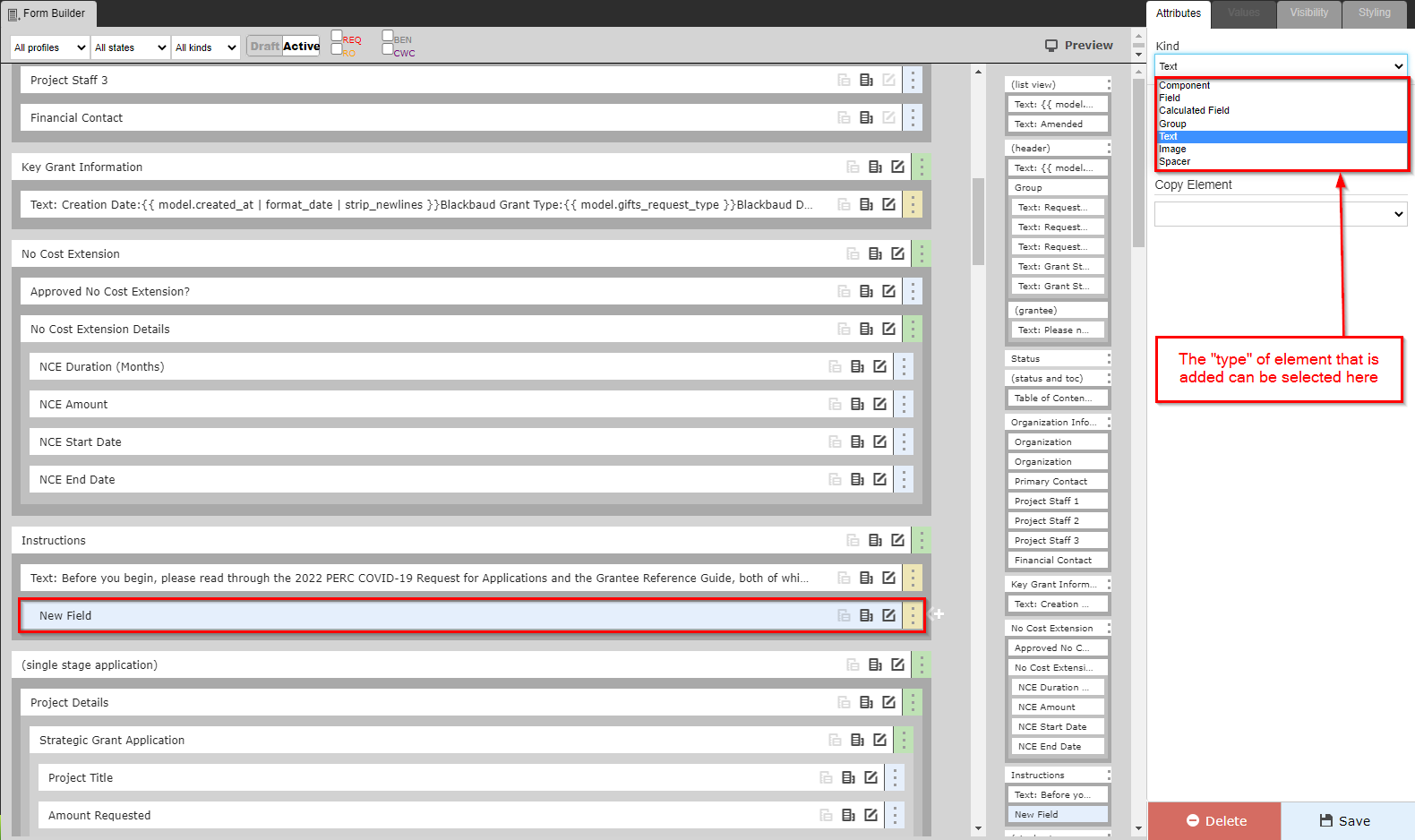
- Component: This element will based on a Component. These are unique "fields" that differ widely one from the other. See the Component Configuration section for more details.
- Field: The most used type. This will allow the element to pull in a column from the record type in question; e.g. if we're looking at a Grant Requests form, any column off of the Grants Request data type can be pulled into a field element.
- Calculated Field: Same as field, above, but can pull in calculated fields as opposed to your run of the mill columns. Calculated fields are fields that use math to combine several different "real" fields into one, combined numeric field. Think "Total Score" on review records as an example.
- Group: Groups are used to group various fields and other element types. See the Group Configuration section for more details.
- Text: Used to configure flat (or dynamic) text on a form. See the Text Configuration section for more details.
- Image: Can be used to upload an image. Not widely used by the WPP.
- Spacer: As the name implies, adds at least 1 line of space wherever this element is added. The element can also be adjusted to add more than one line of space, if so desired.
Group Configuration
Groups have specific Configuration options that are good to be aware of. Groups are very important for Form design as they allow for several pieces of additional functionality: for example, they (1) allow for a dynamic table of contents that allows you to include within the TOC the Groups most relevant to the record in question and (2) allow for dynamic If/Then Logic (also known as Hide/Display Logic in this guide), e.g. if I select "Yes" for Field X, then display Fields W, Y, and Z (but don't display W, Y, and Z if I select "No" in Field X).
...