| Table of Contents | ||
|---|---|---|
|
Workflows
In Fluxx, Workflows control what buttons and statuses are available for a given theme and determines how a given form flows through said statuses.
...
This applies not just for Requirements but also for Grant Applications, Reviews, Amendments, and Registrations.
The Workflows Admin Panel Screen
The Workflows screen within the Admin Panel lets you everything described above as well as allows you to edit existing workflows in the event that these need to change after they have been finalized.
...
Example image of what appears when you click on one of the statuses from the Workflow screen. See below for a description of the items seen boxed in the image.

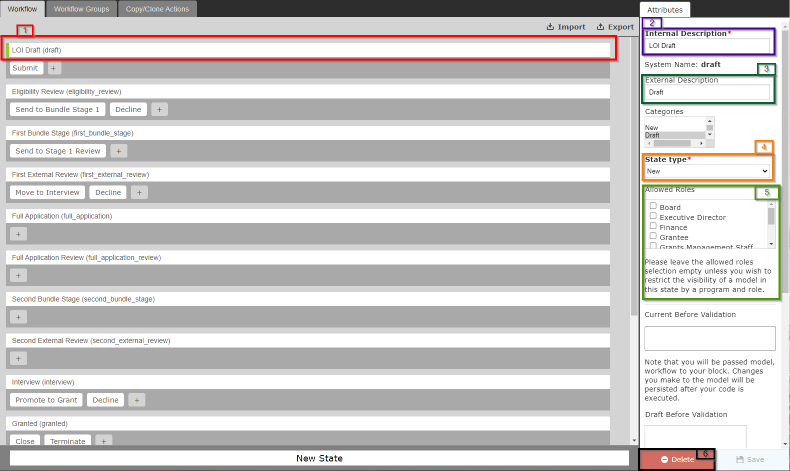
- Box # 1: Shows the status that you currently have selected. You can tell which status is currently selected NOT ONLY based off of the name (match name of status with "Internal Name" from box # 2), BUT ALSO from the slim green line that appears to the LEFT of the status name.
- Box # 2: Shows the configurable Internal Description of this status. This is the title of the status as it appears to Staff Members when looking at records in the system that have this status.
- Box # 3: Shows the configurable External Description of this status. This is the title of the status as it appears to Grantees, Reviewers, and other non-staff members when they review records in their portal. NOTE: For most statuses that ARE NOT "New," "Approved," or "Declined," the WPP uses a Generic External Description like "Under Review" so that Grantees/Reviewers, etc. are not constantly checking for status updates/so that they don't have visibility into the exact stage that their application/record is currently in.
- Box # 4: Shows the Status (AKA "State") Type that this status is. There are four type:
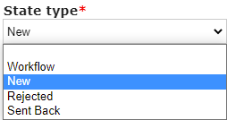
- New: Represents a workflow where the record has not yet been submitted by the grantee/is sitting in its initial stage.
- Workflow: The main "Type" that we use, Workflow is basically any status that doesn't fall into one of the other categories.
- Rejected: The type "Rejected" represents statuses for when the record was NOT accepted/approved by the WPP; the main status that falls into this category is the status of "Declined."
- Sent Back: The type "Sent Back" is not currently used at the WPP, but it would be used for statuses for which the Grantee/Reviewer must re-review/re-complete/fill out again a form after the WPP has decided that the Grantee/Reviewer must take a second pass at the record.
- Box # 5: Shows the "Allowed Roles" for this status. As per the help text underneath this box: "Please leave the allowed roles selection empty unless you wish to restrict the visibility of a model in this status by a program and role." That is, if an Allowed Role is selected, only users with this specific role will be able to see records in this status (users WITHOUT one of the selected roles will have the record hidden for them). The WPP leaves this blank for every status at this time.
- Box # 6: Shows the Delete button for if you wanted to Delete this status. IT IS HIGHLY RECOMMENDED NOT TO DELETE STATUSES UNLESS ABSOLUTELY CRITICALLY NECESSARY as there are several system settings/displays set up based off of statuses. Basically, don't do this unless you know what you're doing and have tested this in the Pre-Production environment. If you need to stop using a status, you don't need to delete it; you can simply re-arrange the buttons/the target statuses that the buttons point to such that records never pass through the undesired status. That will have the same effect as "Deleting" the status from the workflow without breaking anything in the system.
Button Options
Example image of what appears when you click on one of the Buttons from the Workflow screen. See below for a description of the items seen boxed in the image.
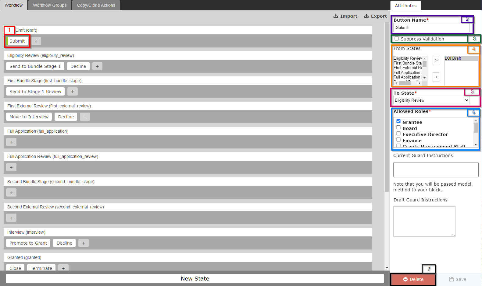
- Box # 1: Shows the Button that you currently have selected. You can tell which Button is currently selected NOT ONLY based off of the name (match name of Button with "Button Name" from box # 2), BUT ALSO from the slim green line that appears to the LEFT of the button name.
- Box # 2: Shows the configurable Button Name. This is the title of the button as it appears when an External or Internal User goes to move the record to another status. The Title of the Button should be closely related to the Status that the button moves the record to (see box # 5 to see which status the button will move the record to). In the image above, for example, the button moves the record from a status of "LOI Draft" (the "New" status when the record is just created and not yet submitted by the Grantee) to a status of "Eligibility Review" (the first review status for the WPP team). Since this button is effectively "Submitting" the record to the WPP for the first time, this button is titled "Submit."
- Box # 3: Shows the "Suppress Validation" checkbox. Don't click on this. If selected, the system will not run any validation on the record when this button is "pressed" and will move the record to the new status without any controls. The WPP always wants to run validation when a button is selected such that records don't move statuses inappropriately (i.e. when not all of the Required Fields have been filled out).