...
- Box # 1: Shows the Theme (Form) itself (in this screenshot, the 2022 COVID-19 Response Grant Application Theme) in Builder mode. In Builder mode, all of the text and fields that are found on the Theme can be be seen as a rectangular box (see screenshot below for example). The item that is currently selected is highlighted in Light Blue. In the screenshot, above, the Group item "(list view)" is selected. Items selected can be dragged around the screen in Box # 1 in order to move the position of this item around. Example box:

- The Color found on the far right-hand side of each of these boxes indicates what type of item it is on the form.
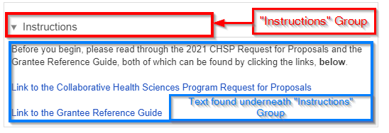
- A Green strip indicates a Group item. Groups are used to organize fields on the form. Text items, component items, and field items can be placed underneath Groups to either visually "group" those items underneath the Group header, or just to group them on the backend for administrative ease without having a visual effect on the Form. See an example of how items get visually "grouped" here below:
- A Yellow (or Gold) strip indicates that the item is Text. Text items are NOT fields and all text within them can be edited/changed as needed.
- A Red/Pink strip indicates that the item is a Component. Components are fields (almost under their own Field Type) added to cards to perform a specific predetermined job. These can range from document components which allow you upload/store documents to Financial components and everything in between. Please see this Fluxx page for the full list of Components offered in the system. Please note that components are always evolving and being added.
- A Light Blue strip indicates that the item is a normal Field. This (along with Yellow-stripped Text items) is the most used item on all Themes.
- A Green strip indicates a Group item. Groups are used to organize fields on the form. Text items, component items, and field items can be placed underneath Groups to either visually "group" those items underneath the Group header, or just to group them on the backend for administrative ease without having a visual effect on the Form. See an example of how items get visually "grouped" here below:
- Box # 2: Shows the configuration for the specific item select. In this case, since the Group item "(list view)" is selected, you can configure how that Group item functions. More information specifically about how all Items can be configured can be found in the dedicated Configuration sections below.
Group Configuration
Groups have specific Configuration options that are good to be aware of. See the screenshot and descriptions of the highlighted items in the screenshot below for information on what configuration options are available.
...