...
- Box # 1: The top row shows buttons that can be used to pull in field values from the Record Type, see the background HTML code, and more.
- Field: Allows you to pull in the Values from any field that you can link to within the system; for example, on a Grant Application record, you can pull any Grant Application fields as well as link "through" People records to pull out data from the linked People to the Grant Application. This can be useful when pulling data that should be Read-Only onto a Record. Several formats can be applied to the fields; date field types should always have the "Date" formatting applied; multiple response Fields should always have the "Comma Join" formatting applied.
- Table: Allows you to display a Table of the Values stored in a field on the record. Does not work very well; recommended to use the Field button to do this instead.
- Document Type: This button theoretically would be used to show any documents of a specific type that have been loaded onto the particular Record that you are looking at, but from testing it does not usually show anything. Recommend against using.
- Liquid Block Tag: Used to do If, Then clauses in text using Liquid code. E.g. If Amount Recommended > 0, display amount recommended, otherwise display $0.
- Raw: Displays the text in HTML code format. Allows you to edit the actual background code, which can be useful if you want to do things not immediately available via the formatting menu in the standard text editor.
- Box # 2: Displays the formatting options you have for the text. For example, you can Bold, Italicize, Underline, create tables, etc. to allow you to display the text in the format that is required. Uses more or less standard text formatting tools, e.g. bullet points, text color and text background color, etc.
- Box # 3: Displays the actual box where you will enter/edit the text to be displayed on the form.
- Box # 4: Displays where you can Save the text. This will also close the text window.
Component Configuration
Components are fields (almost under their own Field Type) added to cards to perform a specific, predetermined job. These can range from document components which allow you upload/store documents to Financial components and everything in between. Please see this Fluxx page for the full list of Components offered in the system. Please note that components are always evolving and being added.
Since each component is different and performs a specific job, each has its own configuration settings. Let's take a look at a few examples and see some of the different configuration options available.
Table of Contents Component
As previously mentioned in this article, the Table of Contents component will display all of the Groups that have been marked as "Show in Table of Contents."
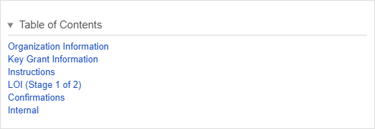
An example of what a Table of Contents component looks like on a form after some groups – namely Organization Information, Key Grant Information, Instructions, LOI (Stage 1 of 2), Confirmations, and Internal – have been marked to "Show in Table of Contents":
Below is an example of what the Table of Contents Component looks like from the Admin Menu Builder view. Please see the descriptions below the screenshot for explanations as to what each boxed section does.
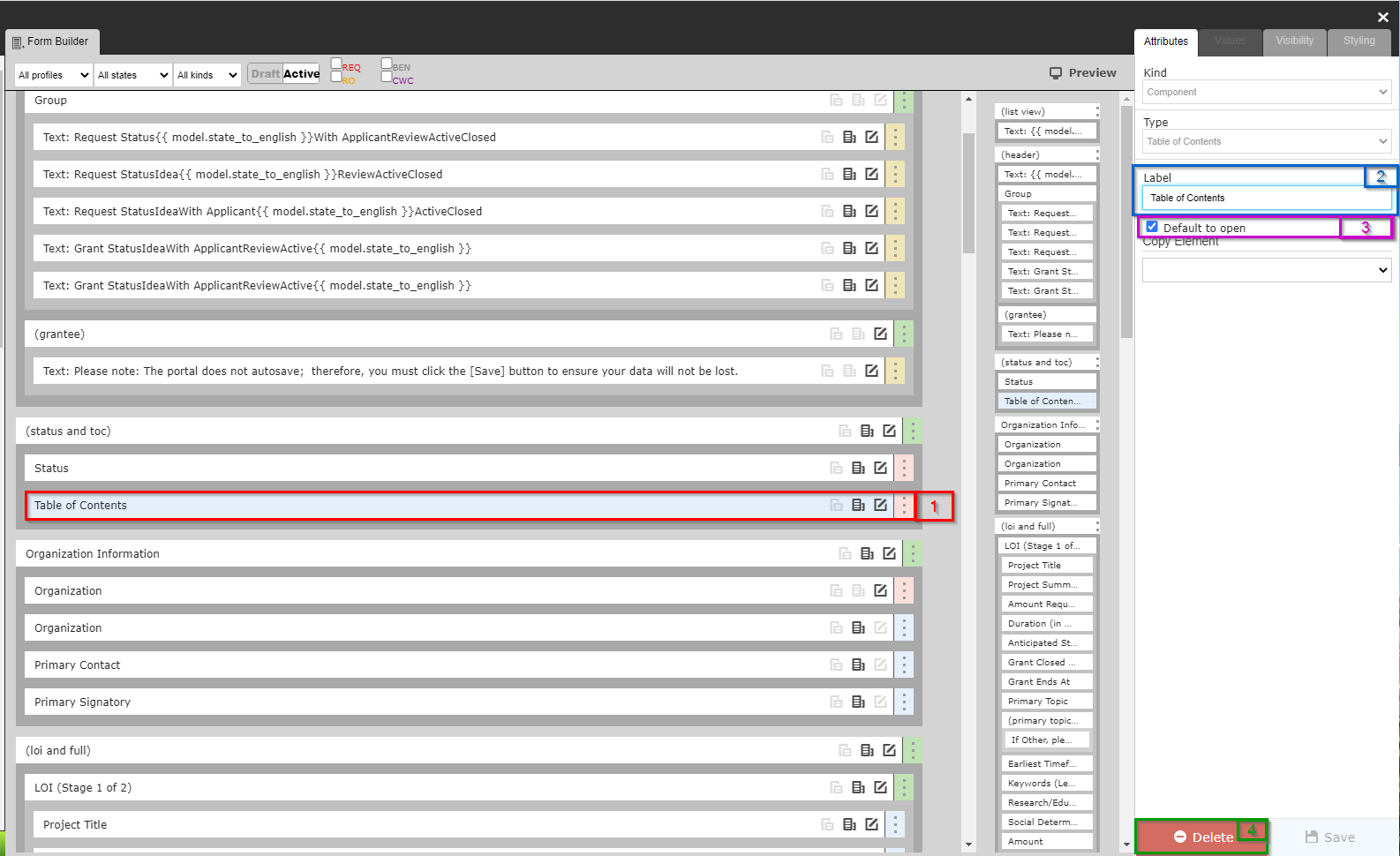
- Box # 1: Shows where the Table of contents has been places in the builder menu and that it is the currently selected item to configure.
- Box # 2: Shows the label of the Table of Contents, which can be configured. However, since "Table of Contents" is very descriptive for what this component is, it's recommended to leave this label alone.
- Box # 3: Shows the checkbox "Default to Open." By selecting this checkbox, the Table of Contents will be open (not collapsed) by default. If this checkbox is NOT selected, the Table of Contents will need to be manually opened in order to be seen. See an example of what this looks like in the screenshot below.
- Box # 4: Shows the "Delete" button where you can remove this component from the form. Note: Deleting the Table of Contents will NOT uncheck the "Show in Table of Contents" checkbox from the various groups previously displayed in the Table of Contents, so if a new Table of Contents component is added, the same groups will make up that TOC if no other actions are taken.