Fields
In computer science, a single piece of data that has several parts, known as a record, can be divided into fields (data fields). Relational databases arrange data as sets of database records, so called rows. Each record consists of several fields; the fields of all records form the columns. Examples of fields: name, gender, hair color.
Within Fluxx, there are several different "types" of fields that determine what data can be entered into a given field and how it displays (both to Employees and to outside users like Grantees and Reviewers).
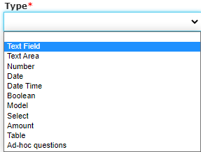
A view of all of the Field Types available in Fluxx:
Note: This guide also discusses the configuration options within the Admin Panel for each different Field Type. For more information on the Admin Panel and how configurations work, please see the dedicated Admin Panel Overview Page and the Forms Menu of the Admin Panel Page.
Field Types
Text Field
A "Text Field," alternatively known as a "String field" in other databases, is a short field that can accept all ASCII characters in it, i.e. numbers, letters, and a limited number of symbols (like &, $, %, *, ^, #, etc.). Text fields are limited to 255 characters (no exceptions to this).
An example of what a Text Field looks like in the system:

Text Field Configuration Options
All field types have unique configuration options. Text Fields are some of the least configurable of all field types. See descriptions of the items boxed in the screenshot, below, for the options of what can be configured with Text Fields.
- Box # 1: Shows the field that's currently selected from the Builder menu, in this case, a Text Field.
- Box # 2: Shows the first piece that's configurable about Text Fields, the Label. Like with all fields (and components), this Label can be changed/made different for each different form that this field lives on. This can be useful if you want to ask the same question with slightly different wording for different grantees (i.e. one wording for PERC and one wording for OAC).
- Box # 3: Shows the "Required" box. When this checkbox is selected, the field will be considered Required for the form. This means that the Grantee will be unable to submit the form without filling out this field. Additionally, the field label will be Bolded on the form.
- Box # 4: Shows the Delete button. This will remove the field from the Form. Note: Deleting a field will also delete any configuration options you have saved for it; if you were to add the same field back to the Form afterwards, it would be added with all configurations moved back to the default.
Text Area
A "Text Area" field is very similar to a "Text Field" except that there is NO CHARACHTER LIMIT by default (see here and here for more information on this). Additionally, "Text Areas" can also be configured to allow for Rich Text Editing, e.g. being able to bold, italicize, underline, or make various other formatting changes to the text. Text Areas are recommended for longer-form answers that are likely to exceed 255 characters in length (and are therefore unsuited for a Text Field).
An example of what a Text Area (with Rich Text Editing enabled) looks like in the system:
Text Area Configuration Options
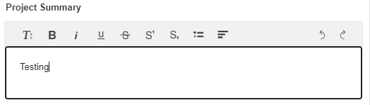
Text Areas have more configuration options that Text Fields. See the screenshot below and the descriptions underneath to see what configuration options are available for Text Areas.
- Box # 1: Shows the field currently selected; in this case, the field selected is, of course, a Text Area.
- Box # 2: Shows the configurable label for the field on this specific form. As with all fields (and components), you can change the label of a Text Area on each and every form on which it lives. This is useful if different text is needed for different groups of Grantees (i.e. PERC vs. OAC Grantees).
- Box # 3: Shows the "Required" box. When this checkbox is selected, the field will be considered Required for the form. This means that the Grantee will be unable to submit the form without filling out this field. Additionally, the field label will be Bolded on the form.
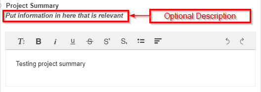
- Box # 4: Shows the Optional Description text area. When text is entered here, it will appear in italics underneath the Text Area's Label. This can be useful for providing additional context for the Grantee about what they should be writing in this field.
- A screenshot of what the Optional Description looks like when configured:
- Box # 5: Shows the Enable Rich Text Editing checkbox. As discussed earlier in this section, when this checkbox is selected Rich Text options like bolding, italicizing, underlining, etc. become available for the text within this specific Text Area. This is useful for fields where a Grantee might want to emphasize certain portions of their text or need certain special text characters/place (e.g. subscripts or superscripts, which are often needed for scientific writing).
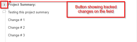
- Box # 6: Shows two closely related configuration options: Track changes and Merge edit history on workflow change.
- When checked, Track Changes will display a small icon next to the Field Label which displays the number of changes that have occurred in this field since Track changes was selected (or, if Track changes was always selected for this field, since editing began). When clicked, a Changelog screen will pop up showing the user the exact changes made in the field.
- Example screenshot of what the Track changes icon looks like next to the Field Label:
- Example screenshot of the Changelog screen that pops up when the "3" icon from above is clicked. On the left (boxed in red) you'll see the current version of the field, and on the right (boxed in blue) you'll see the previous version of this field (which you can restore using the button "restore this version." Additionally, you can use the arrows found in the Changelog screen in order to see previous (and subsequent) changes to/versions of the field.
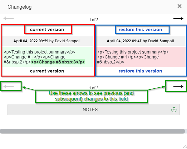
- When checked, the Merge edit history on workflow change checkbox modifies how Track changes functions. Essentially, if this option is turned on, any Workflow change (i.e. any status update, moving the record from one Status to another e.g. submitting an application and thereby moving it from the status of "LOI Draft" to the status of "Eligibility Review") will result in the Track changes icon being cleared and will restart the versioning/tracking of changes from when the record first moved into its new status.
- However, as always, all changes are always tracked within the record audit trail (so information is never lost even when this Configuration option is selected).
- When checked, Track Changes will display a small icon next to the Field Label which displays the number of changes that have occurred in this field since Track changes was selected (or, if Track changes was always selected for this field, since editing began). When clicked, a Changelog screen will pop up showing the user the exact changes made in the field.
- Box # 7: Shows the Character limit (optional) numeric configuration field. This configuration options allows you to enter a number (only numbers are accepted) that will act as the hard character limit for this Text Area. "Characters" include letters, numbers, symbols (e.g. #, $, %, ^, &, etc.), and spaces.
- In general, Fluxx assumes ~5 characters per word, so if you would like to use this field as a "Word limit" you can multiply the number of words you'd like the response to be limited to by 5 (e.g. if I want a word limit of 100 words x 5 average characters/word = ~500 character limit).
- Box # 8: Shows where you can Delete this field from the form. Note: Deleting a field will also delete any configuration options you have saved for it; if you were to add the same field back to the Form afterwards, it would be added with all configurations moved back to the default.
Number Field
A "Number" field, alternatively known as an "Integer" field in other databases, is a field where only integers (i.e. whole positive numbers, no negative values, no decimals, no fractions). No symbols or text can be entered in this field.
An example of what a Number Field looks like in the system:

Number Field Configuration Options
Number fields have a short list of configuration options. See the screenshot and the descriptions of the boxed items there within below.
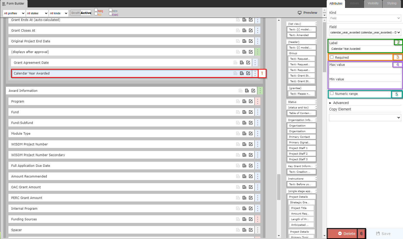
- Box # 1: Shows the field currently selected; in this case, the field selected is, of course, a Number Field.
- Box # 2: Shows the configurable label for the field on this specific form. As with all fields (and components), you can change the label of a Number Field on each and every form on which it lives. This is useful if different text is needed for different groups of Grantees (i.e. PERC vs. OAC Grantees).
- Box # 3: Shows the "Required" box. When this checkbox is selected, the field will be considered Required for the form. This means that the Grantee will be unable to submit the form without filling out this field. Additionally, the field label will be Bolded on the form.
- Box # 4: Shows the Max value and Min value configuration options for the number field. If the Max value and Min value are filled out (with numbers), a user will be unable to advance (e.g. Submit) a Form when the value entered in this field exceeds the Max value or is below (less than) the Min value.
- Box # 5: Shows the Numeric range checkbox. Selecting this check box will make several new options appear (see screenshot below) for the field. Explanations of the new options can be found below the screenshot. In short, selecting this checkbox ensures that users cannot manually enter in values, but instead are required to select a value from one of the options presented (turns Number Field into something more akin to a Select field).
- New options once "Numeric range" checkbox is selected. Please see below the screenshot for explanations of the new options:
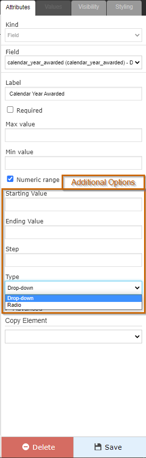
- Starting Value: The "Numeric Range" checkbox (when selected) turns what is normally a Text Box in which only numbers can be entered into a dropdown or checkbox menu where the user must select an existing value (can't type anything in). The Starting Value is the First Value that will be displayed in as a checkbox/dropdown when the Numeric Range checkbox is selected.
- Ending Value: Similar to the Starting Value, the Ending Value is the Final Value (or close to it, see examples below for further explanation) that will be displayed for selection by the user.
- Step: The Step value is used to calculate which values in between the Starting Value and the Ending Value will be displayed. Step represents the difference between that values that the system will display to the user for selection.
- For example, if my Starting Value is "1," my Ending Value is "10," and my Step is "1," the values open to selection will be: 1, 2, 3, 4, 5, 6, 7, 8, 9, or 10.
- In the same scenario if my step is "2" instead of "1," the following values would be available for selection: 1, 3, 5, 7, or 9.
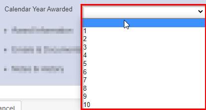
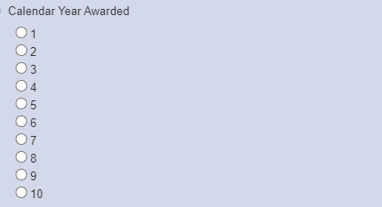
- Type: Determines whether the values will display as a Drop-down menu or as a Radio (checkbox) menu.
- Example of what a Drop-down menu looks like for the scenario from point "e." (with the Step = 1):
- Example of what a Radio (checkbox) menu looks like for the same scenario (again, Step = 1):
- Example of what a Drop-down menu looks like for the scenario from point "e." (with the Step = 1):
- Box # 6: Shows where you can Delete this field from the form. Note: Deleting a field will also delete any configuration options you have saved for it; if you were to add the same field back to the Form afterwards, it would be added with all configurations moved back to the default.
Date Field
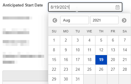
As the name implies, a Date Field allows for users to enter a valid date; additionally, a calendar comes handy with this field type so that users can see the day of the week when selecting a date (or just use the calendar to click on the desired date).
An example of what a Date Field looks like in the system:
Date Field Configuration Options
Date Fields have a very short list of configuration options. Please see the screenshot and below it for descriptions and explanations of what the configuration options are.
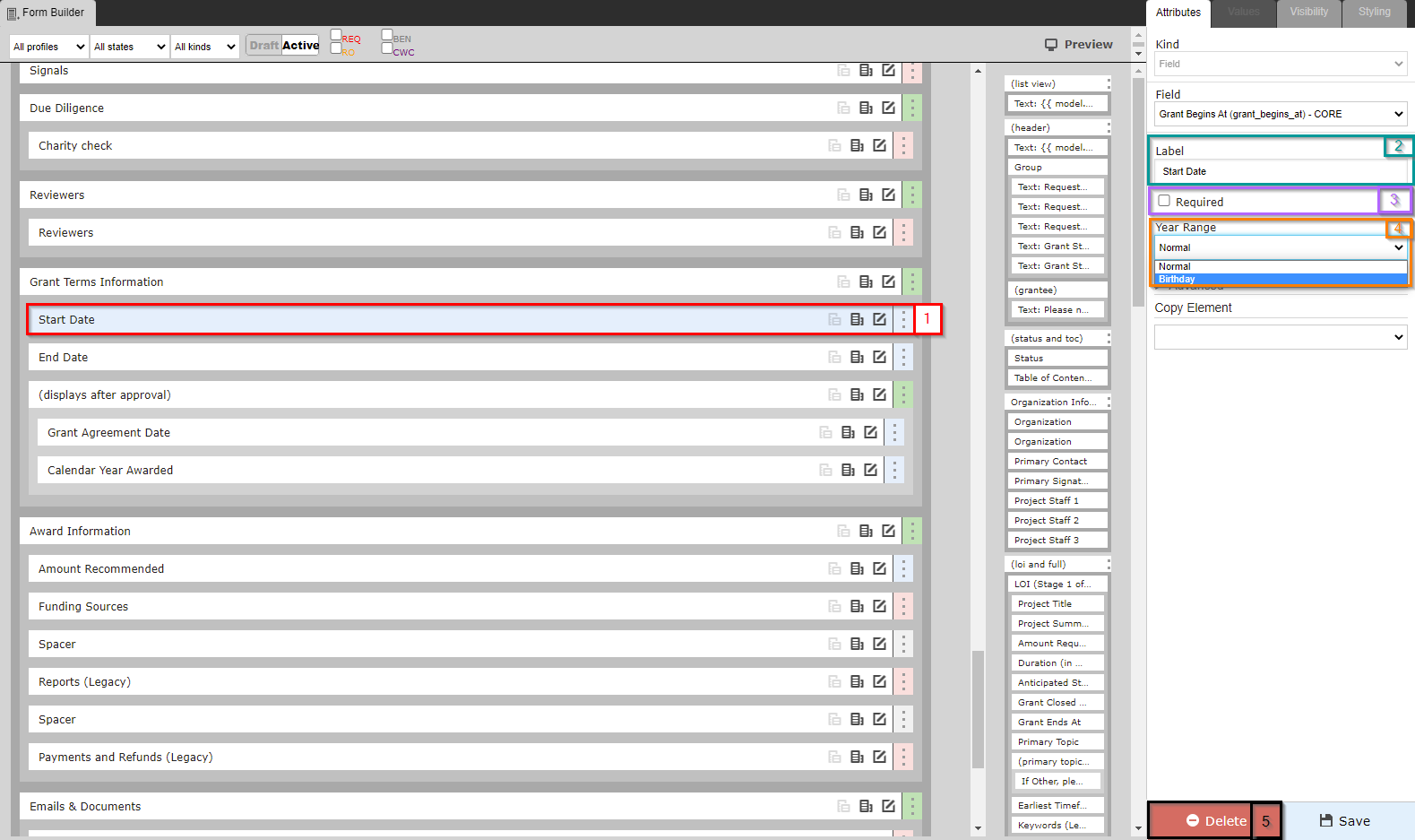
- Box # 1: Shows the field currently selected; in this case, the field selected is, of course, a Date Field.
- Box # 2: Shows the configurable label for the field on this specific form. As with all fields (and components), you can change the label of a Date Field on each and every form on which it lives. This is useful if different text is needed for different groups of Grantees (i.e. PERC vs. OAC Grantees).
- Box # 3: Shows the "Required" checkbox. When this checkbox is selected, the field will be considered Required for the form. This means that the Grantee will be unable to submit the form without filling out this field. Additionally, the field label will be Bolded on the form.
- Box # 4: Shows the Year Range dropdown selection option. The two options are: Normal and Birthday.
- A Normal Year Range means that any date can be selected (past, today, future).
- A Birthday Year Range means that any date through the end of the current calendar year can be selected (so past, today, future up to December 31st of the current year).
- Box # 5: Shows where you can Delete this field from the form. Note: Deleting a field will also delete any configuration options you have saved for it; if you were to add the same field back to the Form afterwards, it would be added with all configurations moved back to the default.
Date Time Field
Date Time fields are similar to date fields, but are stored as UTC then formatted based on the current user's time zone. General recommendation is NOT to create fields of this type and to use Date Fields instead.
An example of what a Date Time field looks like in the system:

Date Time Field Configuration Options
The configuration options for Date Time fields are exactly the same options as for a Date Field. Configuration options are shown in the screenshot below with explanations laid out beneath the screenshot. Note: Again, these are the same options as for the Date Field, but repeated here for emphasis.
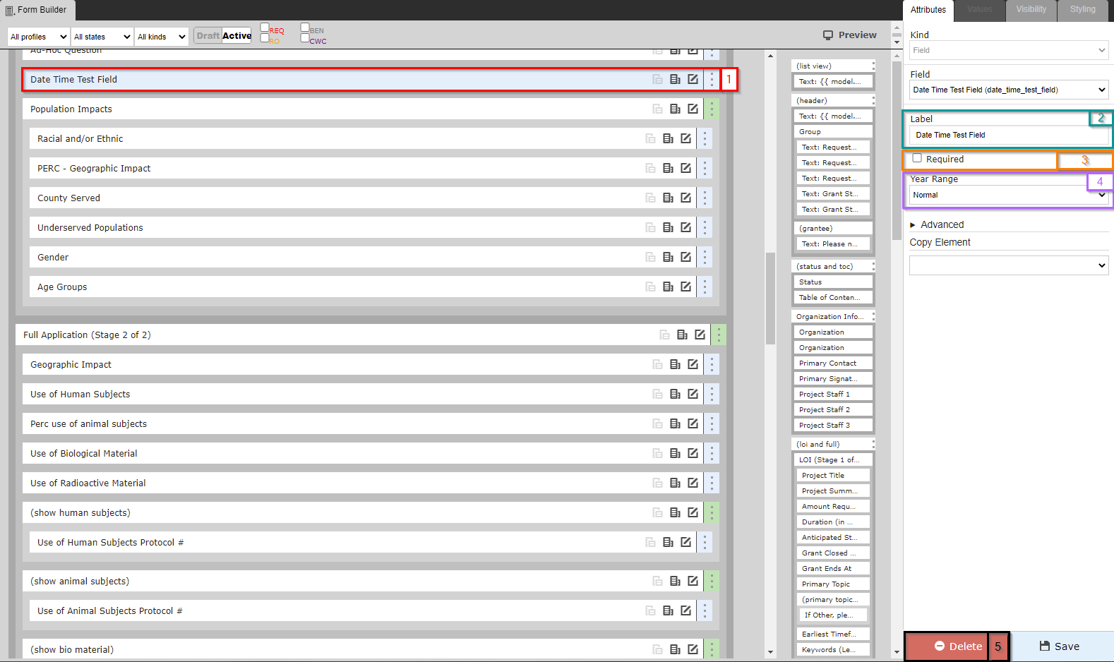
- Box # 1: Shows the field currently selected; in this case, the field selected is, of course, a Date Time Field.
- Box # 2: Shows the configurable label for the field on this specific form. As with all fields (and components), you can change the label of a Date Time Field on each and every form on which it lives. This is useful if different text is needed for different groups of Grantees (i.e. PERC vs. OAC Grantees).
- Box # 3: Shows the "Required" checkbox. When this checkbox is selected, the field will be considered Required for the form. This means that the Grantee will be unable to submit the form without filling out this field. Additionally, the field label will be Bolded on the form.
- Box # 4: Shows the Year Range dropdown selection option. The two options are: Normal and Birthday.
- A Normal Year Range means that any date can be selected (past, today, future).
- A Birthday Year Range means that any date through the end of the current calendar year can be selected (so past, today, future up to December 31st of the current year).
- Note: Since Date Time Fields require a user to manually type in the date, these settings have essentially no effect. You can type in a date far in the future (past the end of the current calendar year) even using the Birthday settings and the system will allow this.
- Box # 5: Shows where you can Delete this field from the form. Note: Deleting a field will also delete any configuration options you have saved for it; if you were to add the same field back to the Form afterwards, it would be added with all configurations moved back to the default.
Boolean Field
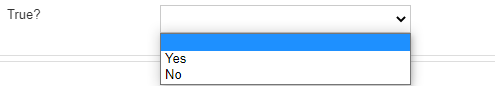
Boolean fields are fields that have can only have 2 possible values – True (1 by default) and False (0 by default). Boolean fields can either be displayed as a checkbox (where Checked = true and unchecked = false, default being blank or false) OR as a dropdown (with no value being selected by default and "Yes" and "No" being the dropdown options by default).
An example of what a Boolean checkbox field looks like in the system:

An example of what a Boolean dropdown field looks like in the system:
Boolean Field Configuration Options
See the screenshot below for the configuration options available for Boolean fields. Beneath the screenshot you can find descriptions of each of the Boxed settings.
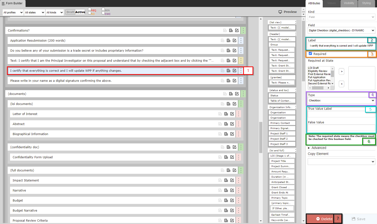
- Box # 1: Shows the field currently selected; in this case, the field selected is, of course, a Boolean Field.
- Box # 2: Shows the configurable label for the field on this specific form. As with all fields (and components), you can change the label of a Boolean Field on each and every form on which it lives. This is useful if different text is needed for different groups of Grantees (i.e. PERC vs. OAC Grantees).
- Box # 3: Shows the "Required" checkbox. When this checkbox is selected, the field will be considered Required for the form. This means that the Grantee will be unable to submit the form without filling out this field. Additionally, the field label will be Bolded on the form.
- Box # 4: Shows the dropdown options for Boolean Type. The two available options are: Checkbox and Dropdown.
- Checkbox: Displays a checkbox that can be checked (equivalent to "Yes" by default) or left blank (equivalent to "No" by default).
- Dropdown: Displays a dropdown menu where blank is the default response (neither "Yes" nor "No") and the dropdown options are "Yes" and "No" by default.
- See the above section "Boolean Field" for examples of what these two different types look like on a form.
- Box # 5: Displays where you can configure the True Value Label and the False Value Label.
- This is used when the Type is set to Dropdown to determine how the dropdown values will display.
- If the type is checkbox, these values won't be displayed to the User (since the interface is just the checkbox to click or unclick, with text next to the checkbox configured by the field Label – see Box # 2's description).
- However, if you are using this field for If/Then (AKA Hide/Display) logic within a Group Configuration, then you need to use the label's configured as the Value. Basically, editing the True/False Value labels for a checkbox will change how the value is stored on the backend (i.e. if I enter the True Value Label as "Absolutely," clicking the checkbox will store the value on the backend as "Absolutely" and the If/Then (or the Hide/Display) logic will key off of the value of "Absolutely" to determine if the group should be shown or not.
- Box # 6: Does not display an actual configuration option, but the text here is very import to understand how Boolean Fields work when they are configured as a Checkbox and is Required.
- The text states: "The required state means the checkbox must be checked for this boolean field."
- Essentially, this means the user will have no choice EXCEPT to select the Checkbox if the Boolean is setup as a checkbox and is required. Otherwise, the user will be unable to advance the record to the next workflow status (e.g. won't be able to submit their application).
- Box # 7: Shows where you can Delete this field from the form. Note: Deleting a field will also delete any configuration options you have saved for it; if you were to add the same field back to the Form afterwards, it would be added with all configurations moved back to the default.
Model Field
A Model field is one that links from the parent record type to another. For example, if we wanted to designate on a Grant Application the employee (who would be a User) that should review the application, we could make a Model field on Grant Requests that links to the "User" record type. Model fields will search records in the linked record type to allow for a direct link from a record of one type to a record of the linked type.
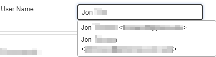
An example of what a Model Field looks like in the system:
Model Field Configuration Options
Model fields have a short list of configuration settings that determines which field on the linked record type is displayed for selection in the Model Field and allows you to filter on which records should be available for selection. Please see the screenshot below for the configurable settings and beneath the screenshot for the descriptions of those settings.
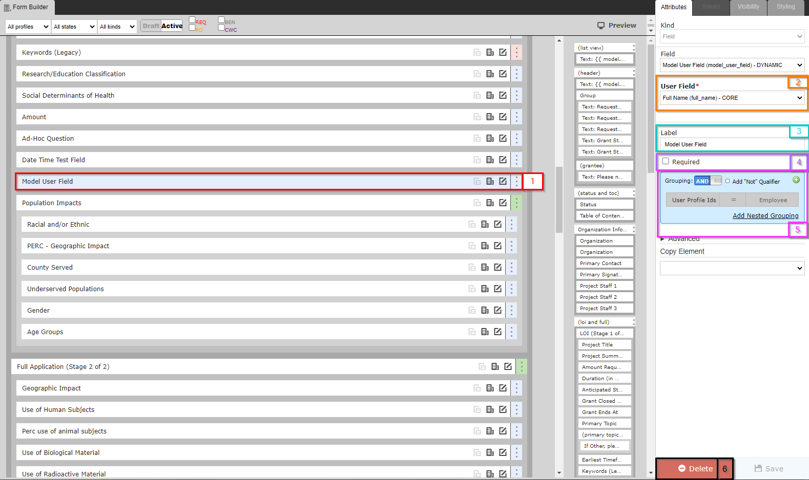
- Box # 1: Shows the field currently selected; in this case, the field selected is, of course, a Model Field. In this case, we are looking at a Model Field which has been set up to link to the User record type.
- Box # 2: Shows the User Field which will be displayed by this Model Field. Since this field is set up to link to the User record type, you can select any field in the User field list to be used in display.
- The recommended option is to use Full Name for User fields. This will ensure that, when looking at a user to select, their First + Last Name will be displayed.
- Another possible option (though not as highly recommended) could be Email. If Email is selected rather than Full Name, the dropdown menu will display users' email addresses rather than their names for selection.
- Box # 3: Shows the configurable label for the field on this specific form. As with all fields (and components), you can change the label of a Model Field on each and every form on which it lives. This is useful if different text is needed for different groups of Grantees (i.e. PERC vs. OAC Grantees).
- Box # 4: Shows the "Required" checkbox. When this checkbox is selected, the field will be considered Required for the form. This means that the Grantee will be unable to submit the form without filling out this field. Additionally, the field label will be Bolded on the form.
- Box # 5: Shows the Filter that can be used to limit which User records are available for selection in this Model Field. Since there are many user records in our system (2,771 at time of writing), it is incredibly useful to be able to set a Filter such that not ALL user records will display in the dropdown menu for selection.
- A recommended filter to use is the one displayed in this screenshot: User Profile Ids. This allows you to limit the users available for selection based off of what Profile (or Portal) they have access to. In this scenario, the filter is set up such that only users that can have an Employee profile (i.e. WPP Employees) can be seen for selection.
- The same Criterion can be used to limit the selection to just Grantees or Reviewers (the value would just have to change from "= Employee" to "= Grantee" or "= Reviewer").
- Box # 6: Shows where you can Delete this field from the form. Note: Deleting a field will also delete any configuration options you have saved for it; if you were to add the same field back to the Form afterwards, it would be added with all configurations moved back to the default.
Select Field
A Select Field, also called a "Dropdown field" in other databases due to the default dropdown menu that appears, is a field with a limited, fixed number of possible values with NO option for a 'write-in' value. While these fields are Single-Select, Dropdown fields by default, each Select Field can be modified to be a multiple-select and can then be configured to be viewed in a number of ways.
As a dropdown menu, Select Fields are single-select (i.e. only one option can be chosen at a time). However, the fields can also be as a "Multiple-Select" field (i.e. more than one value can be selected at a given time) which allows for configuration options such as "Select-Transfer" or as a "Checkboxes" field.
These fields can also be configured to be Hierarchical Dropdowns (i.e. with several 'levels' of options; we can also change the settings so that only options at the lowest level are able to be selected). With these hierarchical dropdowns, we can also enable percentages for the options selected, such that if I select two options I could say one is 75% my focus and the other 25% of my focus.
Fluxx has an article that deals with special conditions surrounding Select Fields. The article can be found here: https://fluxxdev.atlassian.net/servicedesk/customer/portal/1/article/1796146647?src=-1251893069
An example of what a Select Field looks like in the system when configured as a Single-Select Dropdown field:

An example of what a Select Field looks like when configured as a Multiple-Select "Select-Transfer" field:
An example of what a Select Field looks like when configured as an Hierarchical Field before going to select any options:
Example of what a Select Field looks like when configured as an Hierarchical Field when going to select options:
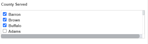
Example of what a Select Field looks like when configured as an Hierarchical Field when two options have already been selected:
Select Field Configuration Options – Single-Select Field
When set-up as Single-Select, Select Fields have a shorter list of configuration options. See the screenshot below and the descriptions of the boxed items beneath it for explanations as to what configuration options are available.
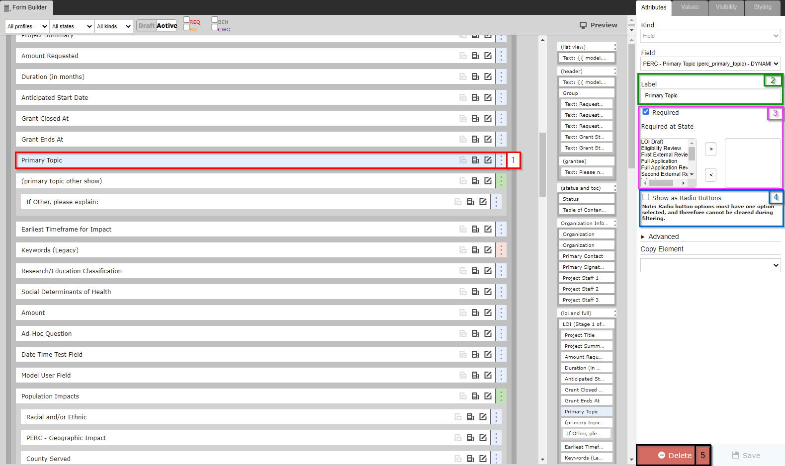
- Box # 1: Shows the field currently selected; in this case, the field selected is, of course, a Select Field.
- Box # 2: Shows the configurable label for the field on this specific form. As with all fields (and components), you can change the label of a Select Field on each and every form on which it lives. This is useful if different text is needed for different groups of Grantees (i.e. PERC vs. OAC Grantees).
- Box # 3: Shows the "Required" checkbox. When this checkbox is selected, the field will be considered Required for the form. This means that the Grantee will be unable to submit the form without filling out this field. Additionally, the field label will be Bolded on the form.
- Box # 4: Shows the "Show as Radio Buttons" checkbox. When checked, this select field will display with a checkbox next to each possible value that can be selected, rather than with a dropdown menu with the options.
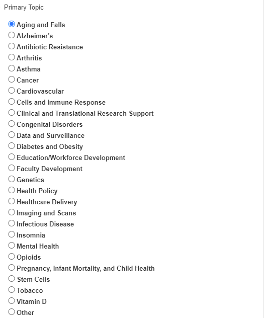
- Example of what a select field with Radio Buttons turned on looks like:
- The help text here is also important. It states: "Note: Radio button options must have one option selected, and therefore cannot be cleared during filtering." Essentially, once this is selected as a radio button, a user will be unable to clear any selection that they have made (they'll only be able to change their selection to another option). Additionally, when filtering, employees will not be able to select the "Blank" or "Null" option for a field configured to use Radio Buttons.
- Box # 5: Shows where you can Delete this field from the form. Note: Deleting a field will also delete any configuration options you have saved for it; if you were to add the same field back to the Form afterwards, it would be added with all configurations moved back to the default.
Select Field Configuration Options – Multiple Response Field
When a Select Field is configured as a Multiple Response Field, the list of Configurations Options is slightly longer. See the screenshot below for a look at the configuration options available and beneath the screenshot for explanations of what each of the configuration options controls.
- Box # 1: Shows the field currently selected; in this case, the field selected is, of course, a Select Field.
- Box # 2: Shows the configurable label for the field on this specific form. As with all fields (and components), you can change the label of a Select Field on each and every form on which it lives. This is useful if different text is needed for different groups of Grantees (i.e. PERC vs. OAC Grantees).
- Box # 3: Shows the "Required" checkbox. When this checkbox is selected, the field will be considered Required for the form. This means that the Grantee will be unable to submit the form without filling out this field. Additionally, the field label will be Bolded on the form.
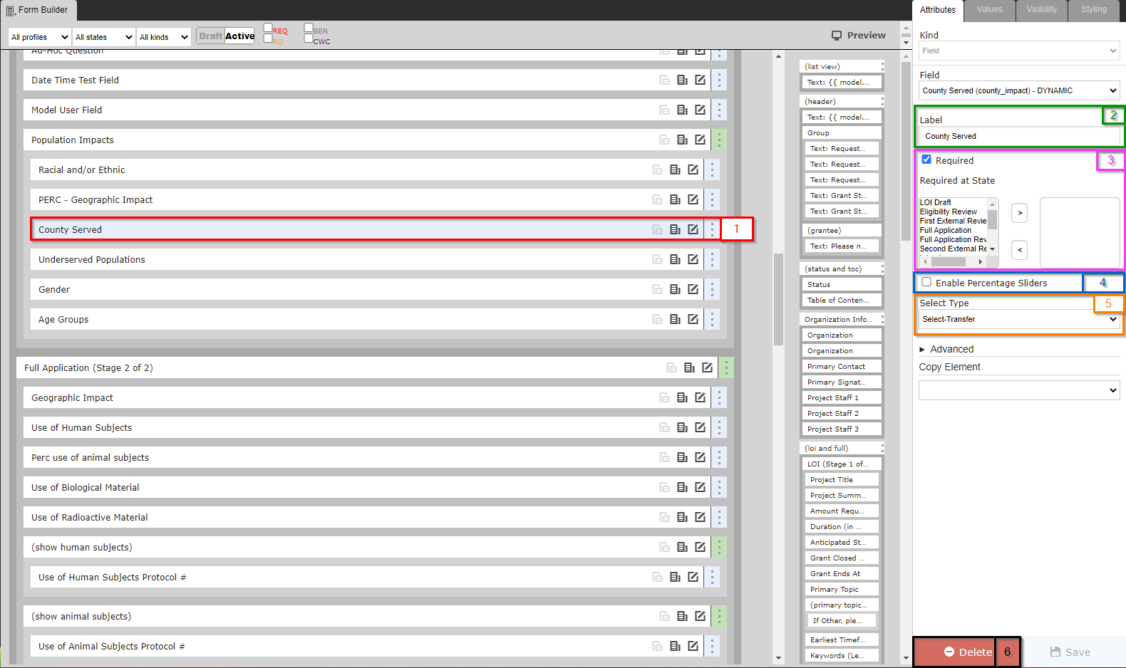
- Box # 4: Shows the "Enable Percentage Sliders" checkbox. When selected, users will be prompted to assign percentages to each of the various values entered into this field so that the user can specify whether, for example, their 3 counties impacted were "evenly" impacted (i.e. 33% each of them) or if one county was more impacted than the other two (by putting that one county at 50% and the other two at 25% each, say).
- An example of what a Multiple-Response Select Field looks like when configured with Percentage Sliders (Evenly distributed among 3 values):
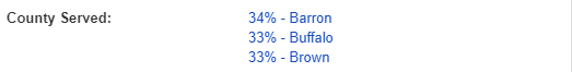
- Same example, but with one county set to 50% and the other two counties evenly distributed:
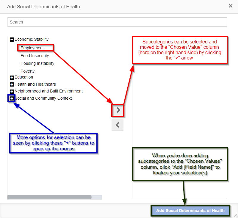
- Box # 5: Shows the "Select Type" dropdown configuration option. This where you can configure how this multiple-select field can be interacted with by users. The three options available are: Select-Transfer, Checkboxes, and Hierarchical Dropdowns.
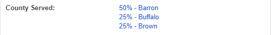
- The default option, Select-Transfer, allows users to "move" values from the unselected, left-hand side box to the box containing "selected" values on the right-hand side using arrows (">" and "<") to move values between the two boxes.
- Example of what a Multiple-Response Select Field looks like when configured as a Select-Transfer. New values can be selected from the left-hand side, and added to the "Selected" values list on the right hand side by click the ">" arrow in between the two boxes (see also the screenshot below).
- The second option, Checkboxes, is similar to the option "Show as Radio Buttons" for Single-Response Select fields. Selecting Checkboxes will display all the value options in a single list with checkboxes that can be checked next to each value. Clicking the checkbox next to a value will make that value "Selected" and unchecking or leaving blank the checkbox next to value will ensure that it is Not Selected.
- Example of what a Multiple-Response Select Field configured with checkboxes will look like with the first three values Selected and the fourth value left Unselected:
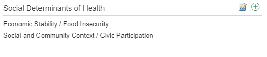
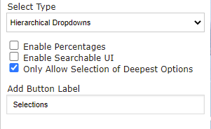
- The third option, Hierarchical Dropdowns, should be used for Multiple-Response Select Fields whose values have different Levels (i.e. there is a hierarchy of values). An example of this in our system is the "Primary Social Determinant of Health" field. This field contains 5 "top level" values, below each of which 4 subcategories live. An example: One top value is "Economic Stability" and the subcategories found underneath it are: "Employment," "Food Insecurity," "Housing Instability," and "Poverty."
- See the main Select Field section for an example of what a Multiple-Response Select Field configured as a Hierarchical Dropdown looks like.
- Several new configuration options will appear when Hierarchical Dropdowns is selected. See the screenshot below for the options and beneath the screenshot for explanations of what those options control:
- Enable Percentages: Similar to Percentage Sliders, selecting this checkbox will allow for users to enter in a percentage for each of the values selected. This allows the user to inform the WPP that perhaps one value is more critical than the others selected for this specific project.
- Example of how a user may edit the percentages of a selection:
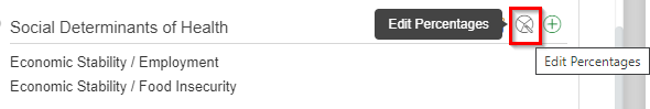
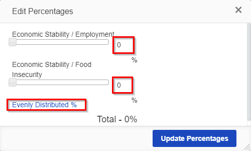
- When the "Edit Percentages" button is clicked, the screen below will appear allowing users to either manually edit the percentages next to each selected value, or to simply click "Evenly Distributed %" in order to have the system automatically split 100% evenly among the number of values selected.
- When Enable Percentages is checked, one other configuration option will appear: Disable validation (100% totals).
- How this checkbox looks from the configuration screen:
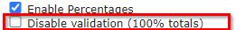
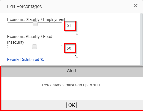
- When this checkbox is NOT selected, the system will display an error message if a user tries to enter in several percentage values that, aggregated, sum to more than 100. This ensures that a user can't state that two values together accounted for 200% of their work, for example. If the checkbox IS SELECTED, no validation will be run and this error message will not appear even if the total percentage is greater than 100.
- Alert message when this option is NOT selected and total % adds up to more than 100:
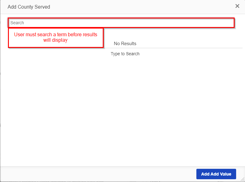
- Enable Searchable UI: When the Enable Searchable UI checkbox is checked, the user will NOT be prompted with ANY of the values available for selection from this multi-select field. Instead, the user will have to search for a term before any possible values appear.
- Example of what a hierarchical multi-select field selection window looks like with Enable Searchable UI turned on:
- Only Allow Selection of Deepest Options: When this checkbox is checked, only the deepest or lowest level of the hierarchy can be selected as a value for this item. This is desired if, for example, the higher levels of the value hierarchy are more for "grouping" values for selection than they are values themselves.
- Add Button Label: This text box allows the user to configure the textual value found when adding new values to this multi-select, hierarchical field. Anything entered into this box will be concatenated to the end of the word "Add" to form the blue button's description when going to enter in values. Since "Add" is already appended to the front, you'll want to avoid using "Add" again in this text box, lest you see a button that looks like the one from the screenshot for Enable Searchable UI (i.e. "Add Add Value").
- WPP generally just has the word "Value" here so that the add button comes out looking like "Add Value."
- Enable Percentages: Similar to Percentage Sliders, selecting this checkbox will allow for users to enter in a percentage for each of the values selected. This allows the user to inform the WPP that perhaps one value is more critical than the others selected for this specific project.
- The default option, Select-Transfer, allows users to "move" values from the unselected, left-hand side box to the box containing "selected" values on the right-hand side using arrows (">" and "<") to move values between the two boxes.
- Box # 6: Shows where you can Delete this field from the form. Note: Deleting a field will also delete any configuration options you have saved for it; if you were to add the same field back to the Form afterwards, it would be added with all configurations moved back to the default.
Amount Field
Amount Fields, also occasionally called "Decimal" fields, are very similar to Number Fields with the additional abilities to use decimal values (not just whole number integers) and to configure the field to have a leading dollar sign ($) or a trailing percent sign (%). Note: While it's possible to add a leading dollar sign or trailing percentage sign, it is not required to do so.
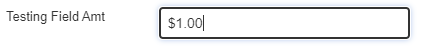
An example of what an Amount Field looks like in the system when configured to have a leading dollar sign:
Amount Field Configuration Options – First Creating the Field/Editing an Existing Amount Field
When you first create a new Amount field (or when you go to Edit an Existing Amount Field), you are presented with the option Decimal Format Type (see the item boxed in blue in the screenshot below).
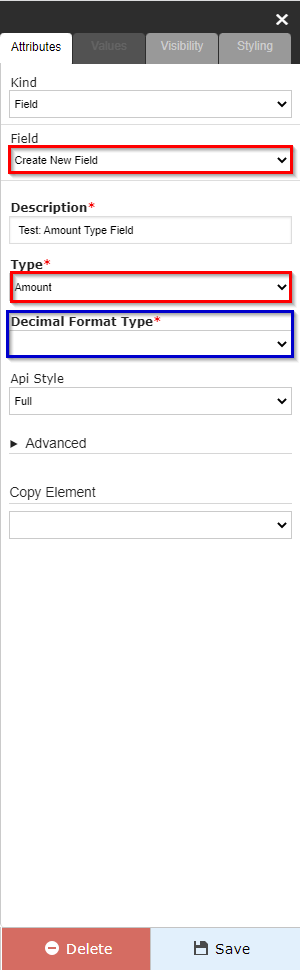
The three options available in the Decimal Format Type dropdown menu are:
- Decimal: Essentially the "default" option, Decimal format means that the field will accept decimal answers (distinguishing this field type from a Number – or Integer – field). No other formatting is applied to the field.
- Example value: 3.012 (notice that the decimal spot is maintained and can go out to as many decimal places as needed).
- Percent: Formats the value such that there is a trailing percentage sign ("%") appended to the end of every value. Values will be rounded up to the nearest Integer percentage (e.g. entering in 50.679% will have the system round the value up to 51%).
- Example value: 51% (notice the trailing % sign at the end of the value).
- Currency: Formats the value such that there is a leading dollar sign ("$") appended to the front of every value. Values can store a maximum of 2 decimal places (since currency values rarely exceed 2 decimal places).
- Example value: $50.67 (notice the leading dollar sign; additionally, a value like 50.679 cannot be entered – it would have to be rounded up to 50.68).
Amount Field Configuration Options – Configuration Options of Existing Fields on a Form
Regardless of which Decimal Format Type your Amount Field is configured with, the options for configuration when adding the Amount field to a form are mostly the same. Please see the screenshot below for highlighted, important items from this screen and beneath the screen for descriptions of said items.
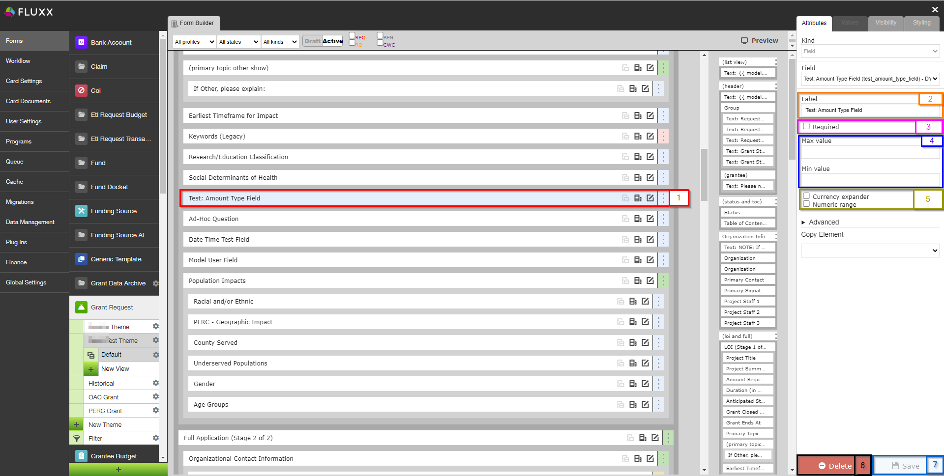
- Box # 1: Shows the field currently selected; in this case, the field selected is, of course, an Amount field.
- Box # 2: Shows the configurable label for the field on this specific form. As with all fields (and components), you can change the label of an Amount Field on each and every form on which it lives. This is useful if different text is needed for different groups of Grantees (i.e. PERC vs. OAC Grantees).
- Box # 3: Shows the "Required" checkbox. When this checkbox is selected, the field will be considered Required for the form. This means that the Grantee will be unable to submit the form without filling out this field. Additionally, the field label will be Bolded on the form.
- Box # 4: Shows the Max value and Min value configuration options for the number field. If the Max value and Min value are filled out (with numbers), a user will be unable to advance (e.g. Submit) a Form when the value entered in this field exceeds the Max value or is below (less than) the Min value.
- Box # 5: Shows two checkboxes which serve as functionality toggles. Please see the descriptions below to better understand what each checkbox controls.
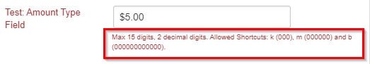
- Currency expander: This option is only available for Amount Fields with a Decimal Format Type of Currency (the checkbox will be hidden if the Decimal Format Type is NOT Currency). When this checkbox IS checked, users will be able to enter common abbreviated forms for high denominations, e.g. entering "$5k" will have the system convert that to "$5,000.00" or entering in "$5m" will have the system convert that to "$5,000,000.00"
- Example of what the help text for an amount field with the currency expander functionality turned on:
- Numeric range: Selecting this check box will make several new options appear for the field. In short, selecting this checkbox ensures that users cannot manually enter in values, but instead are required to select a value from one of the options presented (turns Number Field into something more akin to a Select field).
- This Numeric Range works the same as the Numeric Range for Number Fields. Please see the Number Field Configuration Options section for more information on how to configure a Numeric Range.
- Currency expander: This option is only available for Amount Fields with a Decimal Format Type of Currency (the checkbox will be hidden if the Decimal Format Type is NOT Currency). When this checkbox IS checked, users will be able to enter common abbreviated forms for high denominations, e.g. entering "$5k" will have the system convert that to "$5,000.00" or entering in "$5m" will have the system convert that to "$5,000,000.00"
- Box # 6: Shows where you can Delete this field from the form. Note: Deleting a field will also delete any configuration options you have saved for it; if you were to add the same field back to the Form afterwards, it would be added with all configurations moved back to the default.
- Box # 7: Shows the Save button. As with all fields, if you make any changes whatsoever you'll need to hit the Save button for your changes to be effectuated. If you do not, any unsaved changes will be discarded.
Table Field
A Table Field, as the name implies, is table with a configurable number of rows and columns, as well as configurable column titles. The table can be configured to have either a fixed number of rows or to allow the user to manually add rows as needed.
Note on tables: While table fields look good within Fluxx, it is recommended to avoid using tables whenever possible. The reason is the export format of Table Fields. Please see the example below to see how a table field exports.
An example of what a Table Field looks like in the system, with the setting selected to allow users to add more rows if needed:
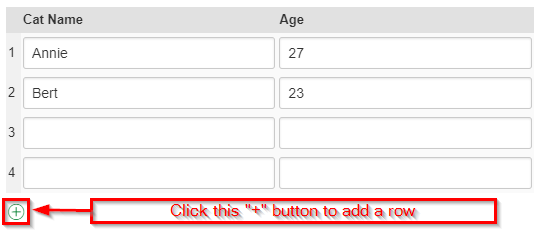
When that table is exported, ALL of its data is exported into a single cell in the CSV/Excel file that generates. Here's what that cell looks like from the export:
| {"a1":"Annie","b1":"27","a2":"Bert","b2":"23","a3":"","b3":"","a4":"","b4":""} |
As you can see, the good-looking table from Fluxx is turned into a bit of a data mess. "Cat Name" row 1 becomes "a1" which is then colon-delimited (":") from its value, "Annie." The same occurs for each subsequent cell and row, with commas (",") separating the cells-their values from each other.
Ad-Hoc Questions Field
Ad-Hoc Questions are similar to Text Areas with the exception that the specific question asked can be added/changed/modified on the fly and made unique to a given grantee, even if the "field" itself is not unique.
Basically, an Ad-Hoc Question field is a placeholder for a question that staff members can write/change on each record for which the Ad-Hoc Question is applied. See the examples, below.
An example of what an Ad-Hoc Question looks like within the system before a question has been configured on this record:
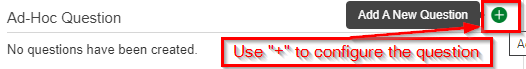
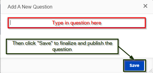
When you click the green "+" button to configure the question, a window will pop up with a small text box. Type in your question there, then click "Save" to finalize and publish the question out to the record in question.
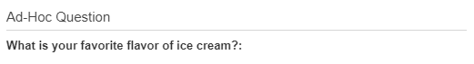
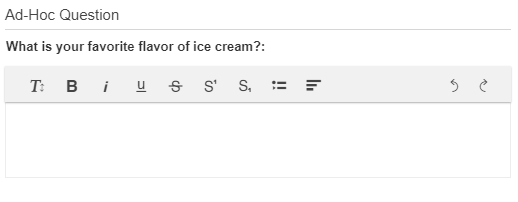
That will finalize the question for this record (again, remember that the question will NOT get configured for any other records that have a the same "Ad-Hoc Question" field on them). The Grantee will then see this question and be able to respond as if it were a Text Area field with Rich Text Editing.
View of the published question from an employee's perspective:
View of this question from the Grantee's portal. As you can see, the question now acts as a Text Area with Rich Text Editing enabled:
Field Modification
Before you go on...
Fluxx has a great article that touches on many of the pieces discussed below. Article can be found here: https://fluxxdev.atlassian.net/servicedesk/customer/portal/1/article/1451884575?src=83393115
Editing Existing Fields
From the Admin Panel → Card Settings → (Relevant Record Type with the Field you'd like to edit e.g. "Grant Request") → "Fields" tab, you can see the list of fields for a given Record Type and even edit/change these existing fields (though you should be highly cautious when doing so – see below for warnings).
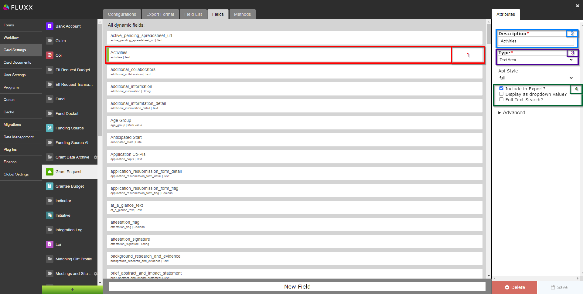
- Box # 1: Shows the Field that you currently have selected. You can tell which Field is currently selected NOT ONLY based off of the name (match name of Field with "Description" from box # 2), BUT ALSO from the slim green line that appears to the LEFT of the Field name.
- Box # 2: Shows the Field Description, which acts as the External Field Name as well as the default label for the field whenever it is added to any Themes (forms) of the Record Type selected (in the image above, Grant Requests). This Description field can be updated without breaking anything in the system (the same is NOT true for other items on this screen),
- Box # 3: Shows the Field Type for the Field selected. You can change the Field Type after a field has been created. However, THIS IS INCREDIBLY DANGEROUS AND SHOULD BE DONE ONLY AFTER YOU HAVE TESTED DOING SO IN PRE-RPODUCTION AND CONFIRMED THERE ARE NO NEGATIVE REPURCUSSIONS. In general, updating a Field Type should only be done if the field itself has no data and was created incorrectly. In most cases, it is best to simply create a brand new field. Do NOT change Field Types on fields with migrated or existing data (unless you are OK with losing access to that data). The data stored is specific to the field type. If you change the type on an existing field with data, for example, a date value will not convert to text or text value to a numerical value. Changing the field type will change the way the data is stored in the database. After a field type change on a field that had existing data, that data will no longer be visible on the front end. The data will have to be re-entered/imported into the new field type in the correct format. If you ARE changing a field type, remember to:
Check existing visibility conditions built with this field.
E.g. When you change the select field to a Boolean field, but you are referencing the select value in your show condition, it will cause the section of the form to not open
Update the form by deleting the field originally on the form, and adding the field with the new field type (otherwise, the item will NOT be updated correctly on your Theme).
- Box # 4: Displays other options you can change/configure for this field. Descriptions of what the various options mean/do:
- Include in Export: Includes the field in the Excel Export function.
- Display as dropdown value?: Only for select, Boolean, and model fields. Will display the entries of the field as a dropdown when being used as a linking field for an embedded card.
- Full-Text Search?: Includes the field’s data as part of what is searched in a card search (i.e. when typing in a search term in the "Search" bar of a card with the same Field Type as this field).