...
- Box # 1: This text box controls the Name of the Group item. Depending on the options selected in Box # 2, the group label can either be displayed or be hidden. If your label is going to be hidden, Fluxx best practices recommends formatting your group label as so: "(label title)" with parentheses "()" surrounding the label and the label text itself in all lower case. This makes it visually clear from the Admin Panel Builder screen (without having to check the configuration) whether or not a group's label is going to be displayed on the Form on not.
- Box # 2: Controls many of the different pieces of functionality about group items:
- Show in Table of Contents: Determines whether or not the Group will display on the Form's Table of Contents if the TOC is added to the form. Note: This checkbox can still be selected even if the TOC is NOT added to the Form. The checkbox simply determines whether or not the group will show in the TOC provided that the TOC IS added to the Form.
- Do Not Show Label: This is the checkbox that determines whether the label will be displayed or whether it will be hidden. If the Checkbox is NOT selected, then the Group item will visually organize components, fields, and text underneath the Group label. If the Checkbox IS selected, then the Group will only organize the items underneath it within the Builder menu from the Admin Panel; the group will NOT serve any visual purpose on the externally-facing form.
- Selecting this Checkbox can be useful if the Group does not need to visually group anything, but all the items do need to have One Visibility Configuration (see the "Values, Visibility, and Styling Configuration" section for more information on this). Any Visibility or Styling Configurations applied at the Group level will apply to all items underneath that group, which can make it very convenient to group several items that need the same configuration under one "dummy" group that serves only as storage for the configuration settings.
- Collapsible: If checked, the group can be Collapsed or Expanded at the User's discretion. Note: If a group is configured to Do Not Show Label, then checking this box won't cause any discernable difference; since the label is hidden, not collapsible section is found.
- An example of a Group item collapsed:

- The same Group Field expanded:
- Default to Open (only displayed if "Collapsible" checkbox is selected): Will automatically Expand a Collapsible field if selected. If not checked, Collapsible fields will by default first appear as Collapsed.
- Disable lazy-loading for this group (only displayed if "Collapsible" checkbox is selected): Lazy loading is essentially delaying the loading of images and other data until a user scroll downs the page (data enter within the viewport). Clicking this checkbox ensure that images/text in this group are loaded when the rest of the Form is loaded. It is generally recommended to leave this checkbox unchecked.
- Box # 3 (only displayed if "Collapsible" checkbox is selected): Displays the "Open in the following states" box. If you do not select Default to Open, then this box can be used to select the Specific Statuses (AKA "States") in which the Collapsible Group will be automatically expanded. For example, if a Group should always be closed by default until a specific status is reached, you can turn off "Default to Open" and use "Open in the following states" field to say that once the record reaches X status, then the collapsible field should be Expanded by default.
- Box # 4: Shows the Dynamic If/Then Logic (also called the Hide/Show Logic in this Guide) functionality box. As stated in the Help Text located immediately below the If/Then Logic header:
To show or hide the contents of this grouping based on a live value in this form, select an item from the "Form Item" dropdown and fill in a value. Contents of this grouping will then only be shown to the user if the field in the form is equal to the value entered.
To summarize, in the "Form Item" section you'll select the Item from the form you want the Show/Hide Logic to be based on. In the "Value" section, you'll enter the value exactly as it would be populated from in the Field selected in the Form Item section. For example, if the Values from the Form Item are "Yes" and "No," your "Value" should either be "Yes" or No" (e.g. not "yes" or "no" as those will NOT work correctly in the Show/Hide Logic).
- Additionally, the "Behavior" dropdown can be used to determine how the Show/Hide Logic works. The options are "Show" and "Hide."
- If you want a specific value for a specific field to make visible a set of items, you'll use the Show behavior.
- If you want a specific value for a specific field to hide a set of items, you'll use the Hide behavior.
- Box # 5: Works in conjunction with Box # 4 (the If/Then or Hide/Show Logic). Essentially, if you want to show (or hide) the items underneath this group for multiple possible Form Items/values, you can add an additional "Form Item," an additional "Behavior," and an additional Value for which to Show or Hide this group. Clicking the Green Plus ("+") button will add additional criteria for the Logic; clicking the Red Minus ("-") button will remove the last set of criteria from the group.
- Box # 6: Shows the Group Character Limit. As stated in the Help Text immediately below the Group Character Limit header:
Enter a number to limit the character count for all text areas in the group.
To summarize, the integer value enter in this section will apply as the character (i.e. letters + spaces + numbers + other characters) limit for all Text Areas found underneath this group. Note: This only applies for Text Areas; Text Fields, which are similar to but smaller than Text Areas, are always limited to 255 characters (no exceptions).
- Box # 7: Shows the box where to Delete this group. Important to Note: When you delete a Group, all items underneath that group will be deleted from the Theme/Form as well. This can make it easy to copy/quickly edit a form that is similar to another but missing one section or another (the whole section in question can be deleted with 1 click). However, this also makes it dangerous to delete groups as you may inadvertently delete fields that are in fact needed for that Theme/Form. Best practices, therefore, is to first move any needed fields out from underneath this group and then to delete the Group (if needed).
Text Configuration
Configuring Text on Themes/Forms is easy once you have the hang of it. Text Items are likely the most used type of items on Themes other than standard Field items.
When clicking on a Text item from the builder, you will see a screen similar to the one found in the screenshot below.
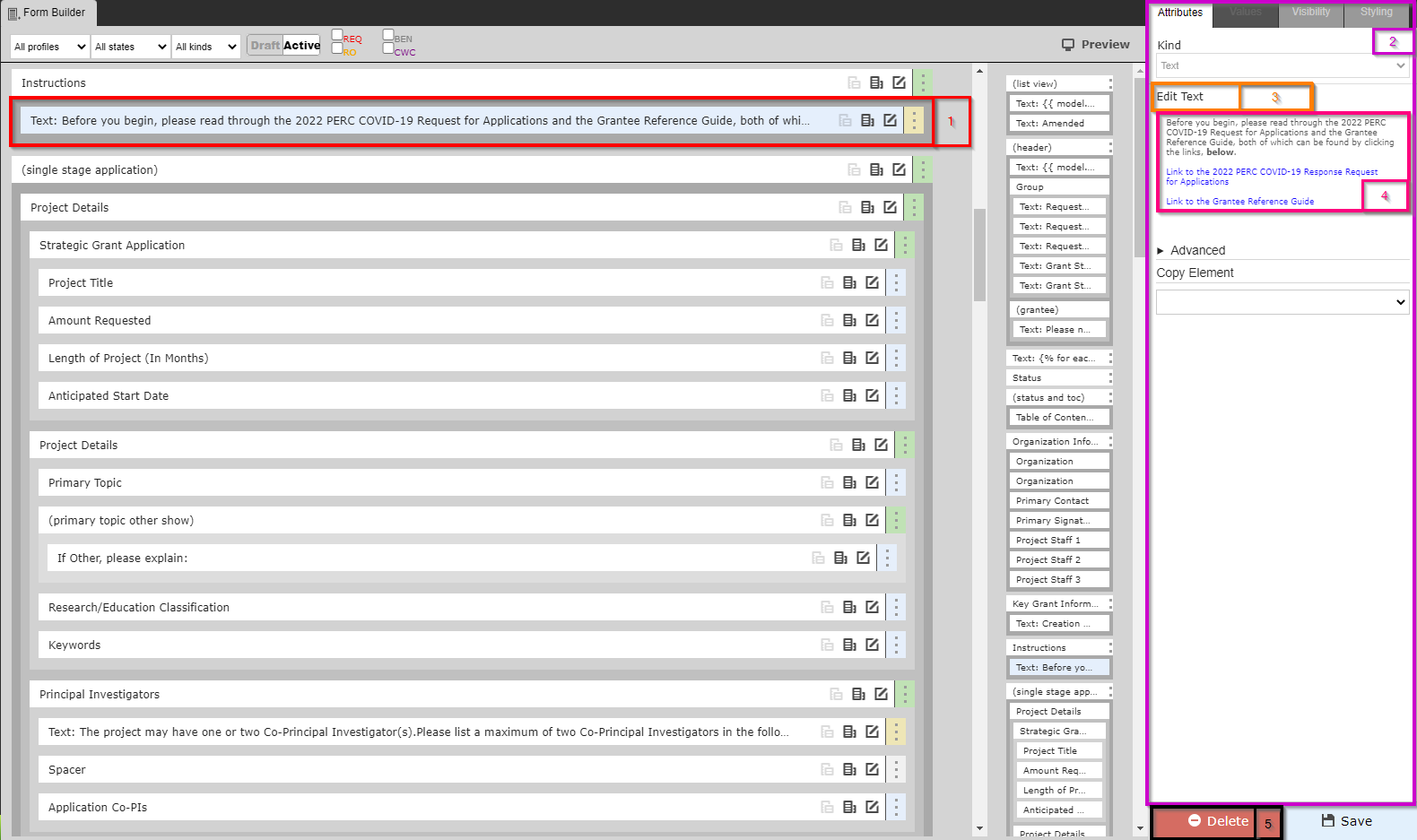
- Box # 1: Shows the selected Theme/Form item; as you can see, text items start with the word "Text:" before displaying a shortened preview of what the configured text says.
- Box # 2: As before in the Builder and Configuration view, Box # 2 shows the configuration options for the text item selected.
- Box # 3: Displays the button "Edit Text" which, as the name implies, will allow you to edit the text in this text item when clicked. More on Text Editing, below.
- Box # 4: Displays a Preview of the text as it will appear on the Theme/Form. If you'd like to edit this text, click "Edit Text" as found in Box # 3.
- Box # 5: Displays the Delete button that will allow you to delete this specific text item.
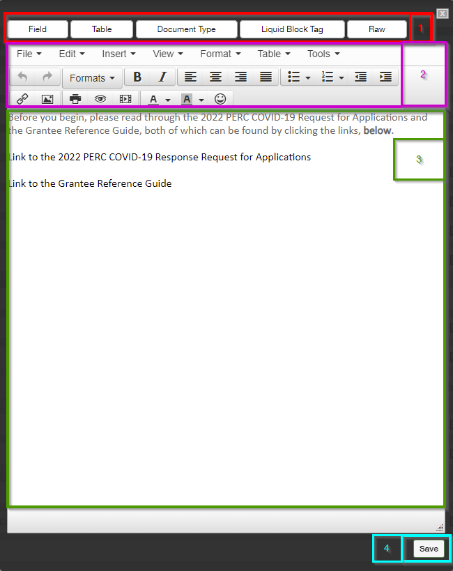
Editing Text
When you click "Edit Text," a screen similar to the one found in the screenshot below will pop up. See the descriptions below the screenshot to get an idea of what options you have when editing Text Items.
Component Configuration
Field Configuration
...