In Fluxx, the Admin Panel is the place to edit/change almost all background settings and the look, feel, and fields of Forms and documents found throughout the system.
In order to access the Admin Panel, your user account must have Admin Privileges.
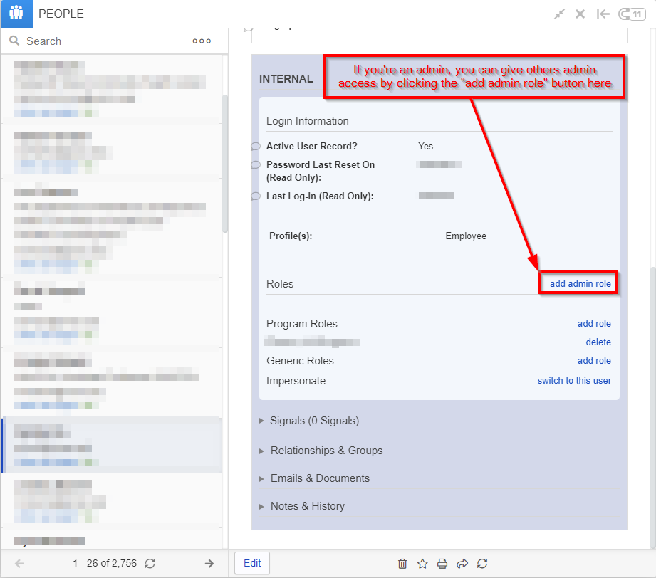
If a new user needs Admin Privileges, a user who is already an admin will need to give them the "Admin" role. As an admin, you can do so by navigating to the user's record, scrolling down to the "Internal" section, and clicking the "add admin role" button found there within (see also the screenshot below).
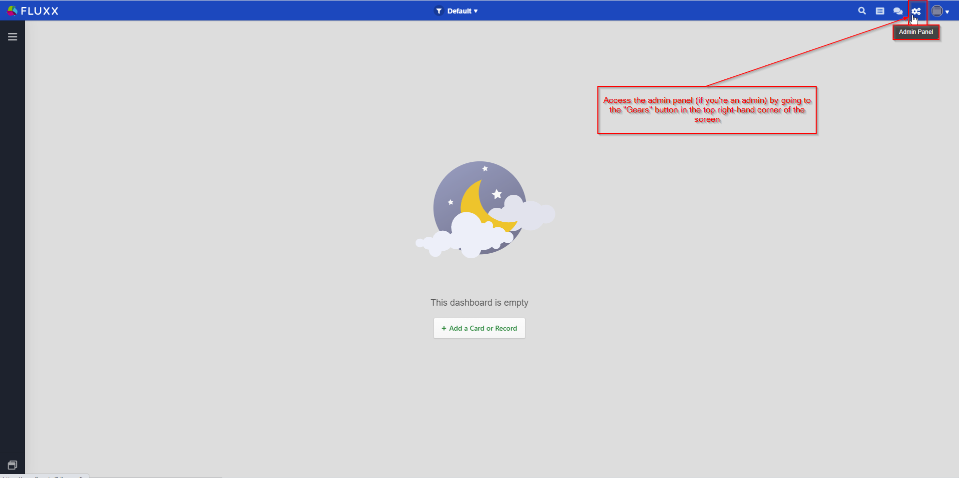
Once the user is listed as an admin, they might need to refresh their browser for the change to take effect. Once it does, the user will be able to see the "Gears" icon needed to access the Admin Panel (see the next section for more information on this).
Accessing the Admin Panel
If you're user account has Admin Privileges, you'll be able to see a "Gears" icon in the top right-hand corner of your screen from any dashboard you are on (see also the screenshot below). If you do have Admin Privileges, you can just click on the Gears icon to be brought into the Admin Panel.
Note: Fluxx best practices recommend CTRL + Clicking on the Admin Panel gears (or right-clicking and selecting "Open Link in New Tab"); the reason for this is that it will allow you to see both the Front End (via the dashboard that you clicked on the Gears from) AND the backend form data in the second tab.
Into the Admin Panel
Once you click the "Gears" button, you'll be brought into the Admin Panel, which should look somewhat like the screenshot, below. See below for descriptions of the boxed items in the screenshot.
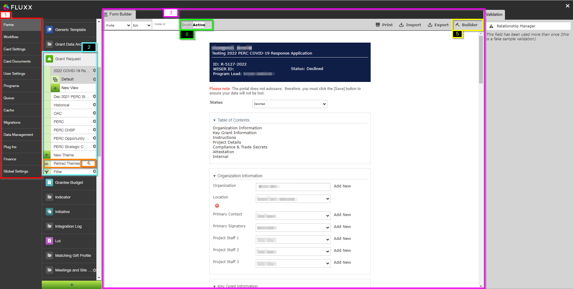
- Box # 1: Shows the Main Menu Grouping, the highest level of grouping within the Admin Panel. Underneath most of the Main Menus, you'll find Submenus (see box # 2 for an example of this) that allow you to edit/change records in different record types, i.e. change the form for a Grant Application vs. Change the form for a Requirement. Description for each of the Main Menu Groupings:
- Forms – This is the most used of the Main Menus. Forms dictate how applications, requirements, organization, user, etc. records appear, what fields they contain, and dictate required formatting for said fields. This is where you create new applications or edit existing ones.
- Workflow – Probably the third most used Main Menu. Dictates how the Workflow should flow for each "Theme" of every Data Type. This is where you can edit how a workflow functions and where you'll add new workflows to newly-created forms. NOTE: EVERY form that uses workflows (I.e. Grant Applications, Requirements, Registrations, Reviews, and Amendments) MUST have a workflow assigned to it, otherwise grantees will be unable to submit these forms to the Partnership Program.
- Card Settings
- Card Documents
- User Settings
- Programs
- Queue
- Cache
- Migrations
- Data Management
- Plug Ins
- Finance
- Global Settings
- Box # 2: Shows the Submenu "Grant Request" and the already-built Themes (different application form types) underneath the submenu. If you want to edit/preview a specific theme, simply click on its name from this list to select it.
- Additionally, you can find the "New Theme" button at the of this list before "Retired Themes" and "Filter." This allows you to create a new application form either from scratch or by copying another form first.
- Box # 3: Displays the Preview of the Theme currently selected. In the example screenshot, you can see a Preview of the "2022 COVID-19 Response Application" (the currently selected Theme).
- Box # 4: Displays where you can find Retired Themes. These are application forms that are no longer used, but can still be found for referential (and copying) purposes. Click on "Retired Themes" to see a window with all of the application forms that are no longer used; from this window, you can also "Unretire" these themes (i.e. make them active application forms once again).
- Box # 5: Displays the "Build" button; this is what you'll press in order to begin Editing the form itself. More on building forms can be found on the dedicated Admin Panel page.
- Box # 6: Shows the toggle that allows you to switch an application form from being in "Draft Mode" (not yet usable) to being "Active" (ready for use as an application form). Best practice recommendation is to leave unfinished applications forms in Draft status until they are completed, after which you MUST ENSURE you move it to Active status otherwise the form will not be accessible.