The Forms Menu is the most used of the Fluxx Admin Panel menus. This guide will walk you through how to update/edit/create forms from within the Admin Panel.
Accessing the Forms Menu
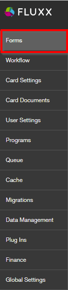
To access the Forms menu, start by going to the Admin Panel (instructions here). In the Admin Panel, the Forms menu is the top Main Menu (see also the screenshot below).
The Forms Menu: Overview
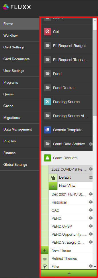
Clicking on the Forms Main Menu will present the several Submenu options available for Forms. In this guide, we'll focus on the Grant Requests submenu (the Grant/Grant Application Record Type). Note: The steps for editing a Form are more or less the same across the various Record Types, so you can follow the steps in this guide for other Forms (e.g. Requirements, Reviews, Amendments, etc.) as well.
Clicking on one of the "Themes" (Forms) found underneath the Grant Request record type will pull up a screen similar to the one found below. Please review the descriptions below the image for an idea of what options are available from the Forms menu.
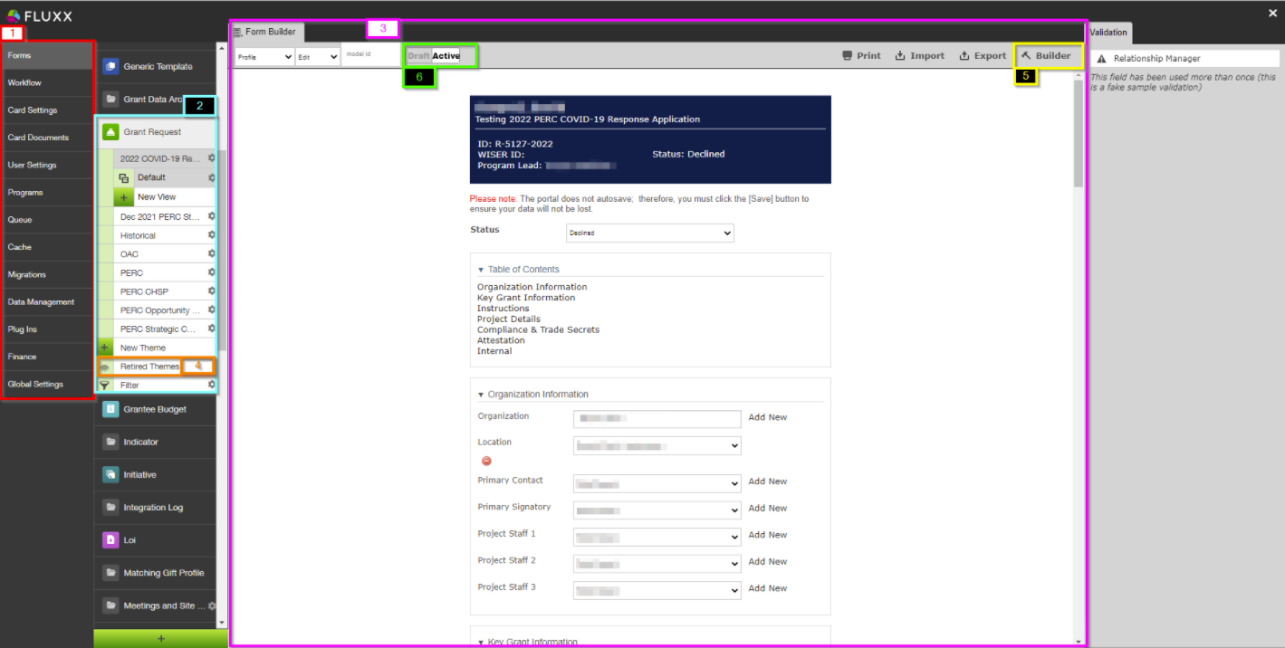
- Box # 1: Still shows the Main Menu Groupings. This is convenient if you need to switch back and forth between two different "Main Menus" while building a form.
- Box # 2: Shows the Submenu "Grant Request" and the already-built Themes (different application form types) underneath the submenu. If you want to edit/preview a specific theme, simply click on its name from this list to select it.
- Additionally, you can find the "New Theme" button at the of this list before "Retired Themes" and "Filter." This allows you to create a new application form either from scratch or by copying another form first.
- Note: Clicking "New Theme" will pull up the a window with both the options to create the new theme from scratch AND to copy the existing view of another theme. It is recommended to always start an application by copying another, and then making the necessary changes on the copy.
- Box # 3: Displays the Preview of the Theme currently selected. In the example screenshot, you can see a Preview of the "2022 COVID-19 Response Application" (the currently selected Theme).
- Box # 4: Displays where you can find Retired Themes. These are application forms that are no longer used, but can still be found for referential (and copying) purposes. Click on "Retired Themes" to see a window with all of the application forms that are no longer used; from this window, you can also "Unretire" these themes (i.e. make them active application forms once again).
- Box # 5: Displays the "Builder" button; this is what you'll press in order to begin Editing the form itself. See the next section "Builder and Configuration View" for more information on this.
- Box # 6: Shows the toggle that allows you to switch an application form from being in "Draft Mode" (not yet usable) to being "Active" (ready for use as an application form). Best practice recommendation is to leave unfinished applications forms in Draft status until they are completed, after which you MUST ENSURE you move it to Active status otherwise the form will not be accessible.
Builder and Configuration View
Upon clicking the "Builder" button, the system will load and a screen similar to the one found in the screenshot below will pull up. This is where and how you actually edit the form, move fields around, edit field labels, add additional fields, change help text, move groupings around, etc. Essentially, if you can see it on a Theme or Form it can be edited/updated here. See below for descriptions of highlighted sections.
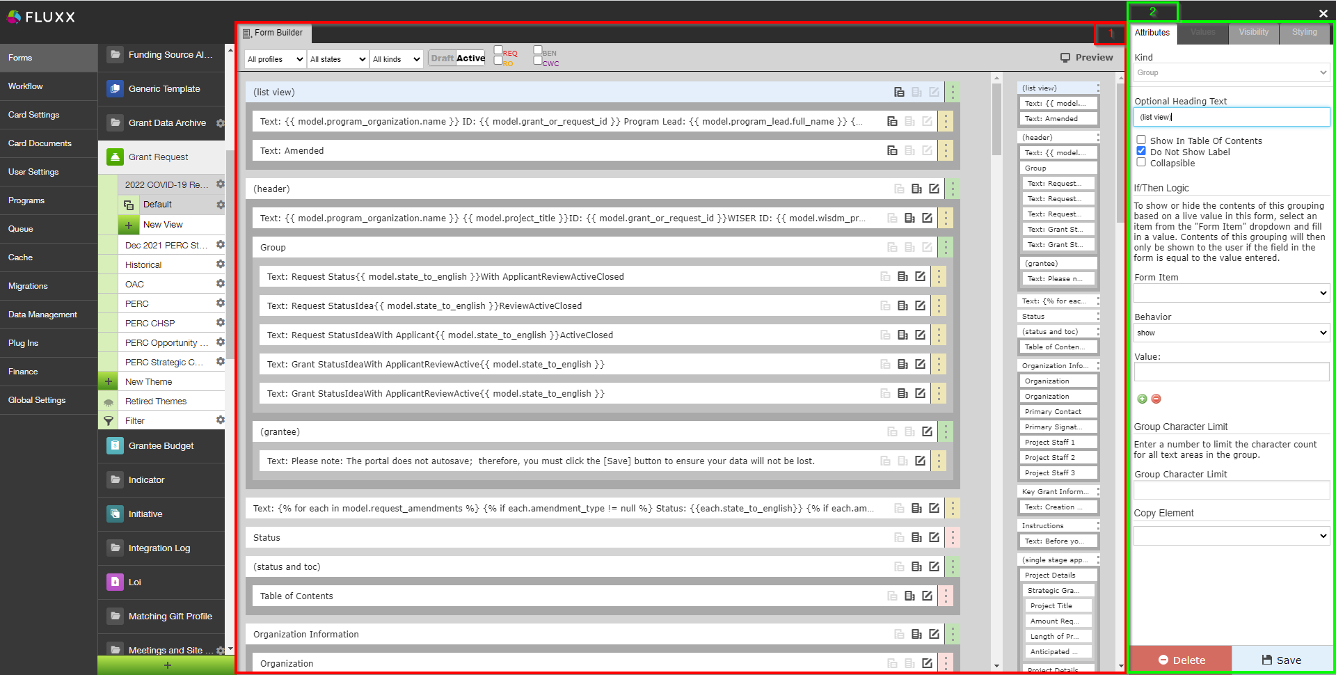
- Box # 1: Shows the Theme (Form) itself (in this screenshot, the 2022 COVID-19 Response Grant Application Theme) in Builder mode. In Builder mode, all of the text and fields that are found on the Theme can be be seen as a rectangular box (see screenshot below for example). The item that is currently selected is highlighted in Light Blue. In the screenshot, above, the Group item "(list view)" is selected. Items selected can be dragged around the screen in Box # 1 in order to move the position of this item around. Example box:

- The Color found on the far right-hand side of each of these boxes indicates what type of item it is on the form.
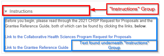
- A Green strip indicates a Group item. Groups are used to organize fields on the form. Text items, component items, and field items can be placed underneath Groups to either visually "group" those items underneath the Group header, or just to group them on the backend for administrative ease without having a visual effect on the Form. See an example of how items get visually "grouped" here below:
- A Yellow (or Gold) strip indicates that the item is Text. Text items are NOT fields and all text within them can be edited/changed as needed.
- A Red/Pink strip indicates that the item is a Component. Components are fields (almost under their own Field Type) added to cards to perform a specific predetermined job. These can range from document components which allow you upload/store documents to Financial components and everything in between. Please see this Fluxx page for the full list of Components offered in the system. Please note that components are always evolving and being added.
- A Light Blue strip indicates that the item is a normal Field. This (along with Yellow-stripped Text items) is the most used item on all Themes.
- A Green strip indicates a Group item. Groups are used to organize fields on the form. Text items, component items, and field items can be placed underneath Groups to either visually "group" those items underneath the Group header, or just to group them on the backend for administrative ease without having a visual effect on the Form. See an example of how items get visually "grouped" here below:
- Box # 2: Shows the configuration for the specific item selected. In this case, since the Group item "(list view)" is selected, you can configure how that Group item functions. More information specifically about how all Items can be configured can be found in the dedicated Configuration sections below.
Group Configuration
Groups have specific Configuration options that are good to be aware of. Groups are very important for Form design as they allow for several pieces of additional functionality: for example, they (1) allow for a dynamic table of contents that allows you to include within the TOC the Groups most relevant to the record in question and (2) allow for dynamic If/Then Logic (also known as Hide/Display Logic in this guide), e.g. if I select "Yes" for Field X, then display Fields W, Y, and Z (but don't display W, Y, and Z if I select "No" in Field X).
See the screenshot and descriptions of the highlighted items in the screenshot below for information on what configuration options are available.
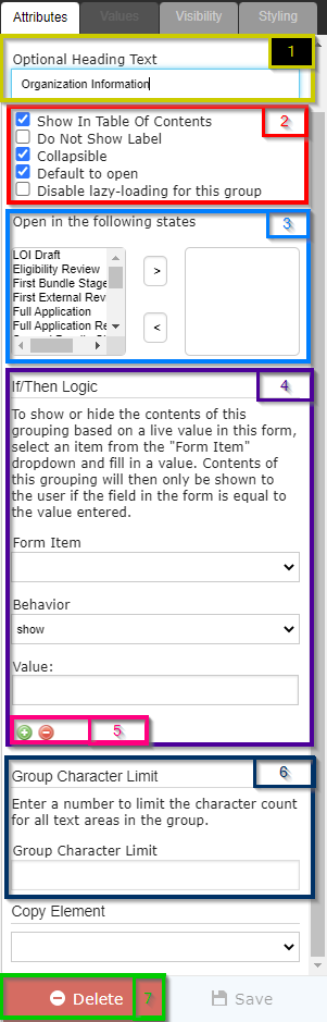
- Box # 1: This text box controls the Name of the Group item. Depending on the options selected in Box # 2, the group label can either be displayed or be hidden. If your label is going to be hidden, Fluxx best practices recommends formatting your group label as so: "(label title)" with parentheses "()" surrounding the label and the label text itself in all lower case. This makes it visually clear from the Admin Panel Builder screen (without having to check the configuration) whether or not a group's label is going to be displayed on the Form on not.
- Box # 2: Controls many of the different pieces of functionality about group items:
- Show in Table of Contents: Determines whether or not the Group will display on the Form's Table of Contents if the TOC is added to the form. Note: This checkbox can still be selected even if the TOC is NOT added to the Form. The checkbox simply determines whether or not the group will show in the TOC provided that the TOC IS added to the Form.
- Do Not Show Label: This is the checkbox that determines whether the label will be displayed or whether it will be hidden. If the Checkbox is NOT selected, then the Group item will visually organize components, fields, and text underneath the Group label. If the Checkbox IS selected, then the Group will only organize the items underneath it within the Builder menu from the Admin Panel; the group will NOT serve any visual purpose on the externally-facing form.
- Selecting this Checkbox can be useful if the Group does not need to visually group anything, but all the items do need to have One Visibility Configuration (see the "Values, Visibility, and Styling Configuration" section for more information on this). Any Visibility or Styling Configurations applied at the Group level will apply to all items underneath that group, which can make it very convenient to group several items that need the same configuration under one "dummy" group that serves only as storage for the configuration settings.
- Collapsible: If checked, the group can be Collapsed or Expanded at the User's discretion. Note: If a group is configured to Do Not Show Label, then checking this box won't cause any discernable difference; since the label is hidden, no collapsible section is found.
- An example of a Group item collapsed:

- The same Group Field expanded:
- Default to Open (only displayed if "Collapsible" checkbox is selected): Will automatically Expand a Collapsible field if selected. If not checked, Collapsible fields will by default first appear as Collapsed.
- Disable lazy-loading for this group (only displayed if "Collapsible" checkbox is selected): Lazy loading is essentially delaying the loading of images and other data until a user scroll downs the page (data enter within the viewport). Clicking this checkbox ensure that images/text in this group are loaded when the rest of the Form is loaded. It is generally recommended to leave this checkbox unchecked.
- Box # 3 (only displayed if "Collapsible" checkbox is selected): Displays the "Open in the following states" box. If you do not select Default to Open, then this box can be used to select the Specific Statuses (AKA "States") in which the Collapsible Group will be automatically expanded. For example, if a Group should always be closed by default until a specific status is reached, you can turn off "Default to Open" and use "Open in the following states" field to say that once the record reaches X status, then the collapsible field should be Expanded by default.
- Box # 4: Shows the Dynamic If/Then Logic (also called the Hide/Show Logic in this Guide) functionality box. As stated in the Help Text located immediately below the If/Then Logic header:
To show or hide the contents of this grouping based on a live value in this form, select an item from the "Form Item" dropdown and fill in a value. Contents of this grouping will then only be shown to the user if the field in the form is equal to the value entered.
To summarize, in the "Form Item" section you'll select the Item from the form you want the Show/Hide Logic to be based on. In the "Value" section, you'll enter the value exactly as it would be populated from in the Field selected in the Form Item section. For example, if the Values from the Form Item are "Yes" and "No," your "Value" should either be "Yes" or No" (e.g. not "yes" or "no" as those will NOT work correctly in the Show/Hide Logic).
- Additionally, the "Behavior" dropdown can be used to determine how the Show/Hide Logic works. The options are "Show" and "Hide."
- If you want a specific value for a specific field to make visible a set of items, you'll use the Show behavior.
- If you want a specific value for a specific field to hide a set of items, you'll use the Hide behavior.
- Box # 5: Works in conjunction with Box # 4 (the If/Then or Hide/Show Logic). Essentially, if you want to show (or hide) the items underneath this group for multiple possible Form Items/values, you can add an additional "Form Item," an additional "Behavior," and an additional Value for which to Show or Hide this group. Clicking the Green Plus ("+") button will add additional criteria for the Logic; clicking the Red Minus ("-") button will remove the last set of criteria from the group.
- Box # 6: Shows the Group Character Limit. As stated in the Help Text immediately below the Group Character Limit header:
Enter a number to limit the character count for all text areas in the group.
To summarize, the integer value enter in this section will apply as the character (i.e. letters + spaces + numbers + other characters) limit for all Text Areas found underneath this group. Note: This only applies for Text Areas; Text Fields, which are similar to but smaller than Text Areas, are always limited to 255 characters (no exceptions).
- Box # 7: Shows the box where to Delete this group. Important to Note: When you delete a Group, all items underneath that group will be deleted from the Theme/Form as well. This can make it easy to copy/quickly edit a form that is similar to another but missing one section or another (the whole section in question can be deleted with 1 click). However, this also makes it dangerous to delete groups as you may inadvertently delete fields that are in fact needed for that Theme/Form. Best practices, therefore, is to first move any needed fields out from underneath this group and then to delete the Group (if needed).
Text Configuration
Configuring Text on Themes/Forms is easy once you have the hang of it. Text Items are likely the most used type of items on Themes other than standard Field items.
When clicking on a Text item from the builder, you will see a screen similar to the one found in the screenshot below. See the descriptions below the screenshot to get an idea for what configuration options are available.
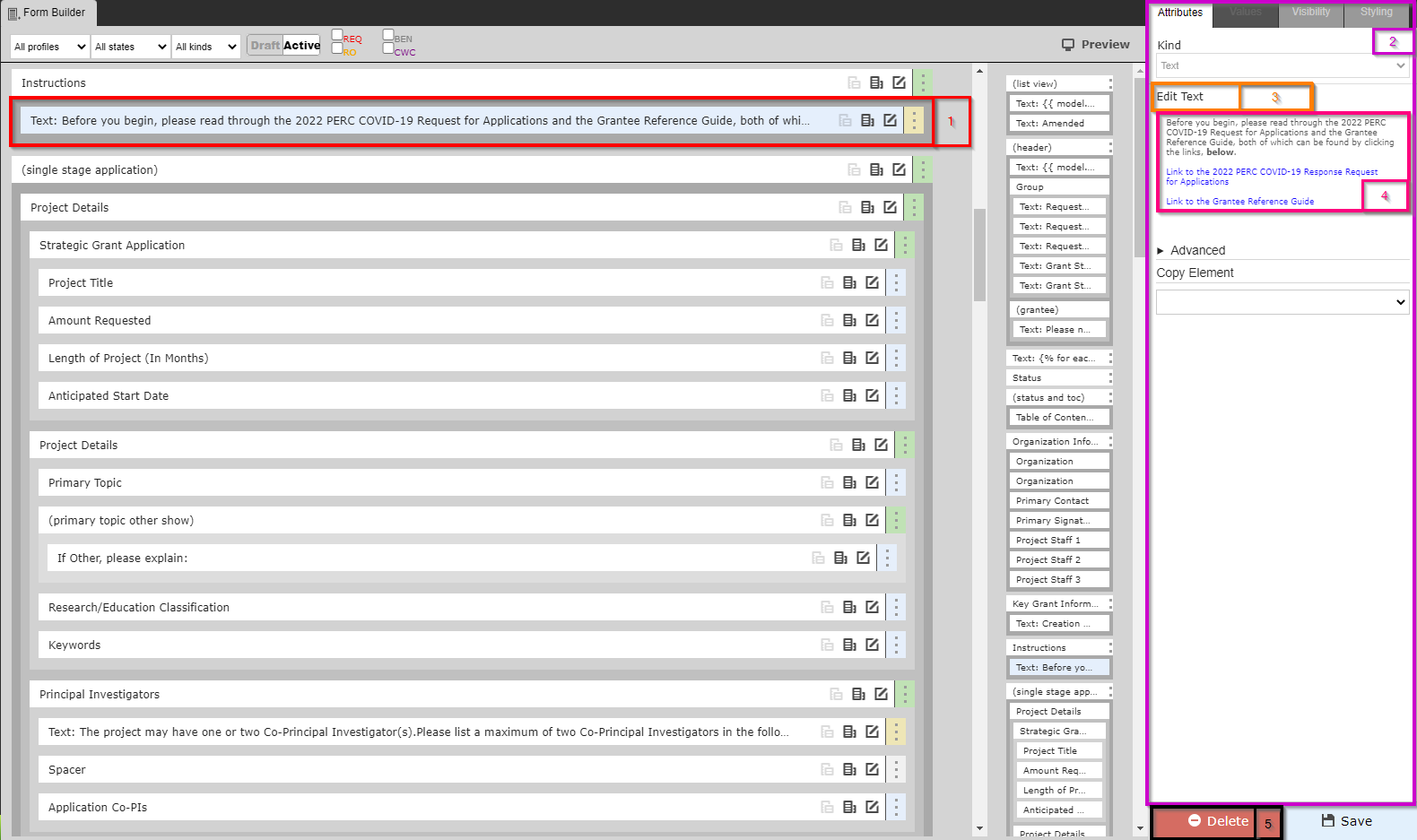
- Box # 1: Shows the selected Theme/Form item; as you can see, text items start with the word "Text:" before displaying a shortened preview of what the configured text says.
- Box # 2: As before in the Builder and Configuration view, Box # 2 shows the configuration options for the text item selected.
- Box # 3: Displays the button "Edit Text" which, as the name implies, will allow you to edit the text in this text item when clicked. More on Text Editing, below.
- Box # 4: Displays a Preview of the text as it will appear on the Theme/Form. If you'd like to edit this text, click "Edit Text" as found in Box # 3.
- Box # 5: Displays the Delete button that will allow you to delete this specific text item.
Editing Text
When you click "Edit Text," a screen similar to the one found in the screenshot below will pop up. See the descriptions below the screenshot to get an idea of what options you have when editing Text Items. Fluxx has an article about this as well: https://fluxxdev.atlassian.net/servicedesk/customer/portal/1/article/1796212588?src=-865580595
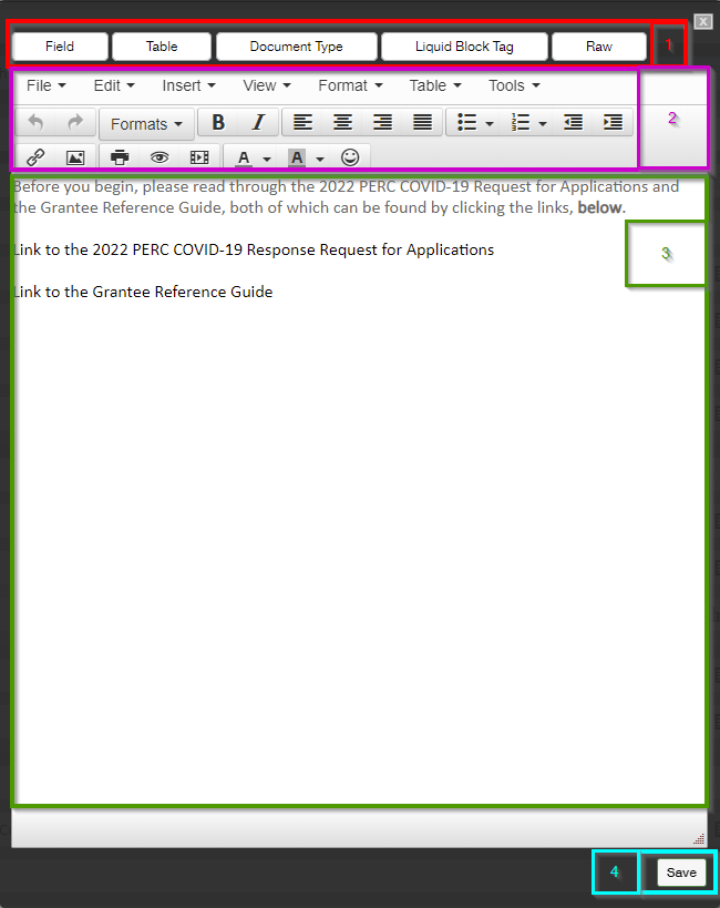
- Box # 1: The top row shows buttons that can be used to pull in field values from the Record Type, see the background HTML code, and more.
- Field: Allows you to pull in the Values from any field that you can link to within the system; for example, on a Grant Application record, you can pull any Grant Application fields as well as link "through" People records to pull out data from the linked People to the Grant Application. This can be useful when pulling data that should be Read-Only onto a Record. Several formats can be applied to the fields; date field types should always have the "Date" formatting applied; multiple response Fields should always have the "Comma Join" formatting applied.
- Table: Allows you to display a Table of the Values stored in a field on the record. Does not work very well; recommended to use the Field button to do this instead.
- Document Type: This button theoretically would be used to show any documents of a specific type that have been loaded onto the particular Record that you are looking at, but from testing it does not usually show anything. Recommend against using.
- Liquid Block Tag: Used to do If, Then clauses in text using Liquid code. E.g. If Amount Recommended > 0, display amount recommended, otherwise display $0.
- Raw: Displays the text in HTML code format. Allows you to edit the actual background code, which can be useful if you want to do things not immediately available via the formatting menu in the standard text editor.
- Box # 2: Displays the formatting options you have for the text. For example, you can Bold, Italicize, Underline, create tables, etc. to allow you to display the text in the format that is required. Uses more or less standard text formatting tools, e.g. bullet points, text color and text background color, etc.
- Box # 3: Displays the actual box where you will enter/edit the text to be displayed on the form.
- Box # 4: Displays where you can Save the text. This will also close the text window.
Component Configuration
Components are fields (almost under their own Field Type) added to cards to perform a specific, predetermined job. These can range from document components which allow you upload/store documents to Financial components and everything in between. Please see this Fluxx page for the full list of Components offered in the system. Please note that components are always evolving and being added.
Since each component is different and performs a specific job, each has its own configuration settings. Let's take a look at a few examples and see some of the different configuration options available.
Table of Contents Component
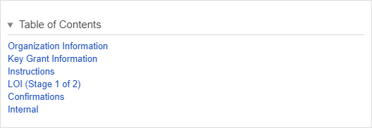
As previously mentioned in this article, the Table of Contents component will display all of the Groups that have been marked as "Show in Table of Contents."
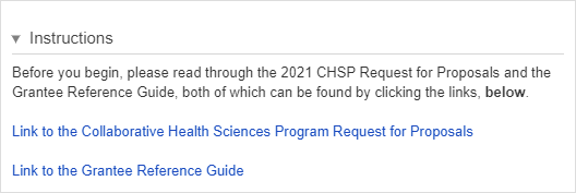
An example of what a Table of Contents component looks like on a form after some groups – namely Organization Information, Key Grant Information, Instructions, LOI (Stage 1 of 2), Confirmations, and Internal – have been marked to "Show in Table of Contents":
Below is an example of what the Table of Contents Component looks like from the Admin Menu Builder view. Please see the descriptions below the screenshot for explanations as to what each boxed section does.
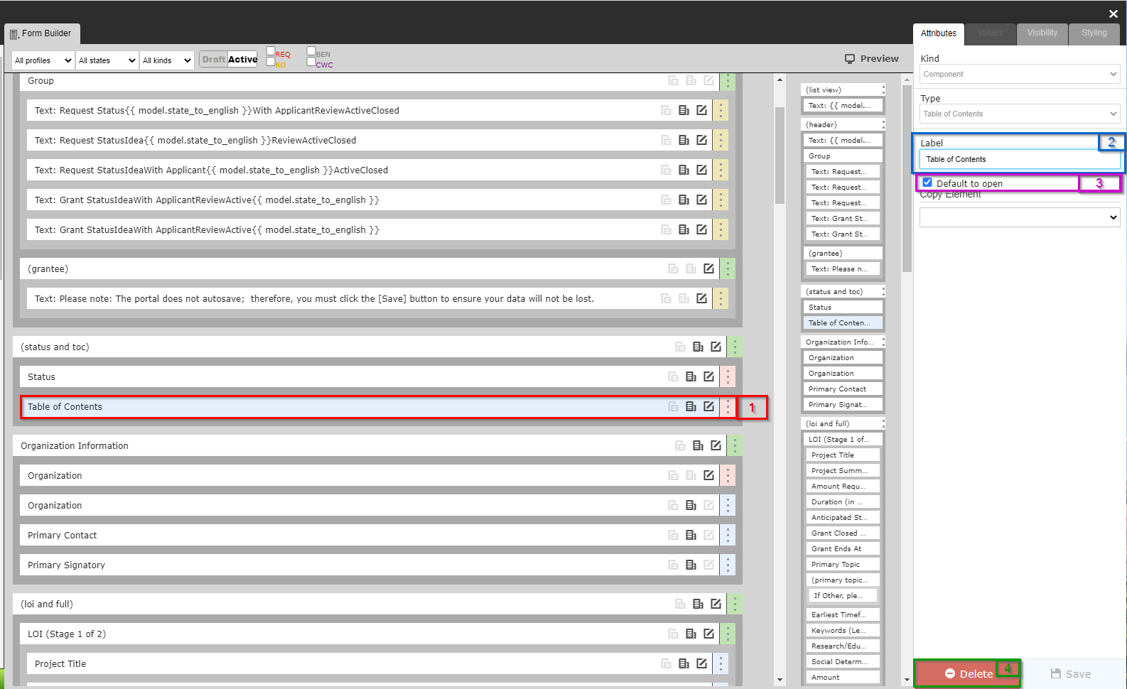
- Box # 1: Shows where the Table of contents has been places in the builder menu and that it is the currently selected item to configure.
- Box # 2: Shows the label of the Table of Contents, which can be configured. However, since "Table of Contents" is very descriptive for what this component is, it's recommended to leave this label alone.
- Box # 3: Shows the checkbox "Default to Open." By selecting this checkbox, the Table of Contents will be open (not collapsed) by default. If this checkbox is NOT selected, the Table of Contents will need to be manually opened in order to be seen. See an example of what this looks like in the screenshot below.
- Box # 4: Shows the "Delete" button where you can remove this component from the form. Note: Deleting the Table of Contents will NOT uncheck the "Show in Table of Contents" checkbox from the various groups previously displayed in the Table of Contents, so if a new Table of Contents component is added, the same groups will make up that TOC if no other actions are taken.
Program Organization Component
As we saw above, some components have few (or none) configuration options.
Some components, on the other hand, have many configuration options. A good example of this latter type of component is the "Program Org" component.
